Your company launched a new system three months ago. The training sessions went well. The dashboards look great in the board deck. And on Tuesday morning, someone in operations still has a spreadsheet open next to it, because "it's quicker this way".
It's tempting to call that resistance to change. In our experience, it's usually feedback. People are telling you, in the only way they can, that the new tool makes their day harder.
The short answer: Employees resist new software mostly when it makes their daily tasks slower, riskier or more confusing than the old way. The fix is rarely more training. It's designing the interface around the real tasks people do: fewer steps, clearer screens, built-in checks and testing with real users before launch.
Why do employees resist new technology?
There's a well-established answer in research. Fred Davis's Technology Acceptance Model (MIS Quarterly, 1989) found that whether people use a system depends on two beliefs: that it helps them do their job better (perceived usefulness) and that it's free of effort (perceived ease of use). In his studies, usefulness had the stronger link to usage, and ease of use appeared to feed into usefulness. A tool that is hard to use doesn't feel useful, however many features it has.
In practice, the reasons we hear when we sit with teams sound like this:
- "It takes more clicks than before." The new flow is longer than the workaround it replaced.
- "I can't find anything." Information people need for one task is spread across tabs, screens or separate tools.
- "I'm scared of getting it wrong." The screen doesn't make the consequences of an action clear, so people double-check everything, or avoid the tool.
- "It doesn't fit how we actually work." The software follows the process on paper, not the one people really run, with all its exceptions.
- "Nobody showed me why it helps me." The benefits go to management reporting, while the extra data entry lands on the person doing the work.
Only the last one is really about change management. The first four are design problems.
Does the design of internal software really matter?
Internal tools often get less design attention than customer-facing products because "our people have to use it anyway". They do have to use it. They don't have to use it well, and they'll find ways around it. Here is what interface design changes in an internal system.
It saves time on every task, every day
An extra screen or a missing search filter costs seconds. In an internal tool those seconds repeat hundreds of times a day across a whole team.
The cost of jumping between tools is measurable. In a Harvard Business Review study (2022), researchers followed 137 people in 20 teams at three Fortune 500 companies, mostly in mid- and back-office roles. People switched between apps and websites about 1,200 times a day, and reorienting after those switches cost just under four hours a week, roughly 9% of their working time. The authors point to the design of work and software, not to the people, as the cause.
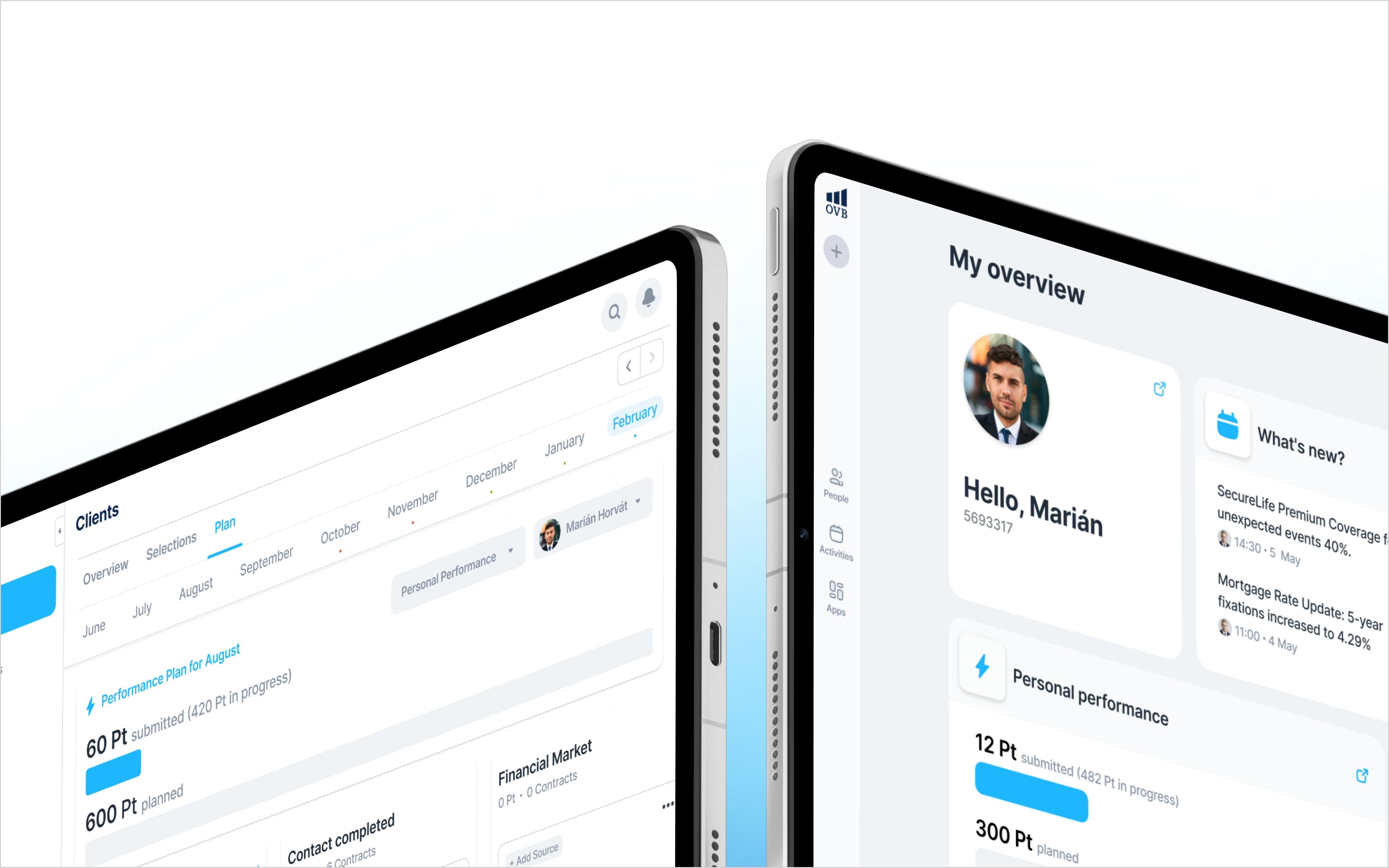
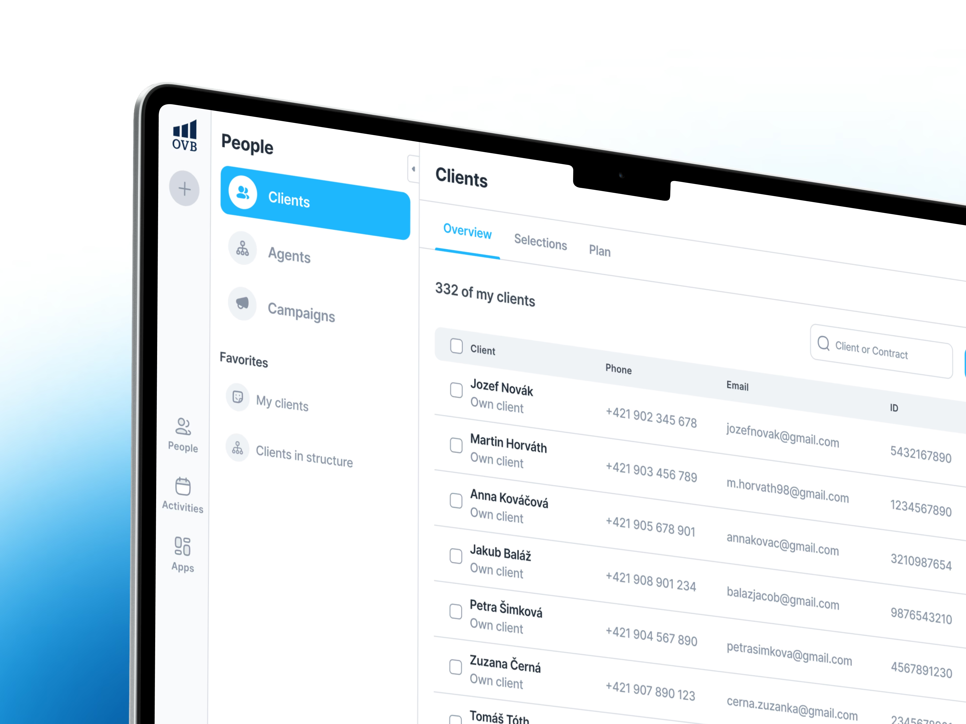
This is why, on OVB's Aero CRM, much of the work was about bringing five tools into one workspace, so an advisor can find a client, plan a meeting and follow up on a task without switching systems.
It prevents expensive mistakes
Confusing screens don't just slow people down. They cause errors that training can't fully prevent.
The best-known example is from banking. In August 2020, Citibank meant to send about $7.8 million in interest payments to Revlon's lenders and wired almost $900 million of its own money as well. According to the court's findings and the appeals court ruling, stopping the principal from leaving the bank required ticking three cryptically named boxes in the loan software (FRONT, FUND and PRINCIPAL). The employee ticked only PRINCIPAL, and the transaction still passed the bank's three-person approval process.
Healthcare shows the same pattern at scale. A study in JAMA (Howe, Ratwani and colleagues, 2018) reviewed 1.735 million patient safety reports and found 557 that explicitly linked possible patient harm to electronic health record usability, for example a date defaulting to the next day without the doctor noticing. The authors note that this is likely an undercount, because such reports are voluntary.
Your business probably doesn't move $900 million or prescribe medication. But the mechanism is the same in every company: a default nobody notices, a field that means something different from what it says, an action that looks reversible but isn't.
It adds clarity: people know what to do next
A good internal screen answers three questions without anyone asking a colleague: where am I, what's done, and what's still missing?
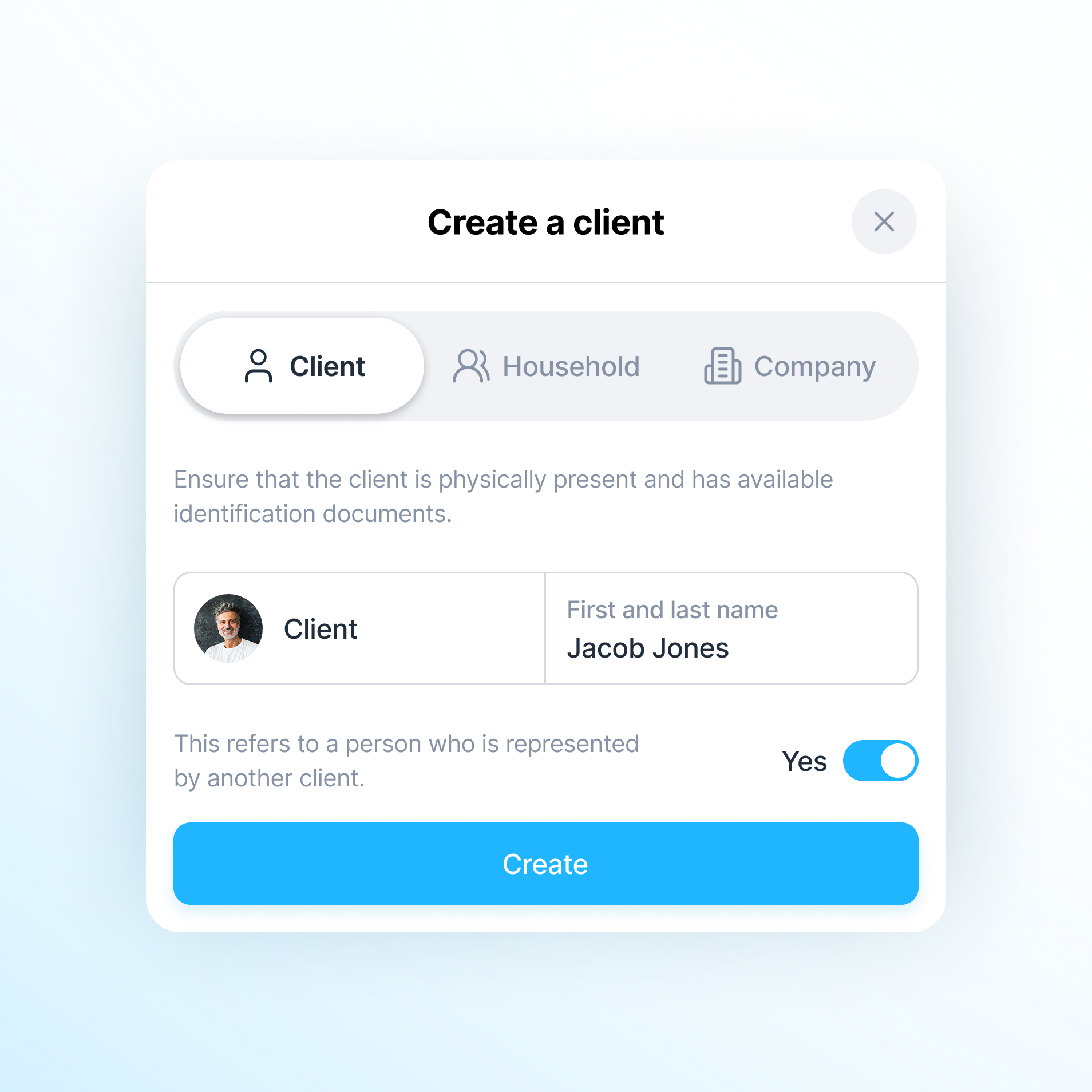
When we built ZKD, OVB's client onboarding process, the flow had to handle individuals, households and companies, plus identity checks, consents, anti-money laundering checks and signing. We built it as a guided flow where advisors can see what's complete, what needs attention and which details are still required before they finish a record. The rules live in the interface, so new and experienced advisors follow the same process.
It drives adoption, which is where the return comes from
A system only pays off when people actually move their work into it. We wrote about this in A new system only pays off when people use it. If people keep the spreadsheet "just in case", you're paying for two processes. Good design is how you make the new process the easier one.
How we design internal software people actually use
This is the process we follow when we design and build internal systems, as part of the build rather than as a separate design project. It follows the same steps as our product design work: research, interviews, a clickable prototype, user testing, UI design and a design system.
1. Watch the real work before designing anything
We start by sitting with the people who will use the system and watching them do ordinary tasks. Not a demo of the process, the actual Tuesday morning version. We look for:
- the spreadsheet open on the second monitor,
- the sticky notes with codes or customer numbers,
- the moments someone asks a colleague for help,
- data typed twice, from one tool into another.
Each workaround is a requirement nobody wrote down. For our work with IDS BK on public transport, the research phase included tens of passenger interviews before design started.
2. Design the task, not the screen
Teams often ask for "a nicer interface". What they usually need is a shorter path through one task. So we map the most frequent tasks first (find a client, approve a request, close a case) and count the steps, screens and fields each one needs. Then we remove what isn't necessary and bring together what belongs together.
A rule we use: a daily task should be possible on one screen, or a clearly guided sequence, without leaving the system.
3. Put the rules into the interface, not into the training manual
If a mistake is expensive, the screen should make it hard to make. In practice:
- Name things in the business's language. No internal codes like "FUND" or "STS 01" where a person has to remember what they mean.
- Make consequences visible. Before an action that sends money, deletes data or notifies a client, show what will happen in plain words.
- Choose safe defaults. Dates, amounts and recipients should default to the most common correct value, and stand out when they don't.
- Show progress and missing information. Tell people what's left before they hit "save", not afterwards with an error code.
- Give feedback after every action. A small confirmation or state change tells people the system did what they meant. We used this kind of on-screen feedback in our CloudTalk redesign.
4. Test a clickable prototype with five people per round
Before development, we test the important flows as a clickable prototype with real users, while changes are still cheap. We don't need a big study. Nielsen Norman Group's research shows that testing with about five users uncovers most usability problems in a qualitative test, and that several small rounds beat one large one. We wrote about how we ran these sessions for IDS BK in our usability testing article.
For internal software, testing is even easier to organise than for consumer apps: your users already work for you. An hour with five people from different roles is enough to see where they hesitate.
5. Keep it consistent with a design system
Once a pattern works, it should work the same everywhere: the same filters, the same buttons in the same places, the same way of showing errors. A shared design system keeps internal tools consistent as new modules get added, so people don't have to relearn the product with every release. For CloudTalk, we designed 450+ screens across desktop and mobile on one shared design system.
6. Roll out by team and measure completed work
We roll out in phases and treat feedback from each group as input for the next release, as we did with Aero's phased rollout. And we measure completed work rather than logins (see the table below).
How do you measure software adoption?
Logins tell you people opened the system. They don't tell you whether the old process has gone. These are the measures we find most useful:
| What to measure | What it tells you | How to collect it |
|---|---|---|
| Tasks completed end to end in the new system | Whether the old process has really been replaced | System events, compared with the old volume |
| Time to complete a key task | Whether the design saves time | Short observed sessions before and after launch |
| Workarounds still in use | Where the system still falls short | Ask: "What do you still do outside the system?" |
| Errors and corrections | Whether screens cause mistakes | Correction logs, support tickets, audit findings |
| Help requests per task | Which flows aren't self-explanatory | Support tickets, questions to team leads |
| User-reported ease of use | How the experience feels | A short survey such as the System Usability Scale (SUS) |
Be honest about what each number is. On Aero, OVB reports a 20–30% improvement in work efficiency, but that comes from a user survey: it's a perception, not a measured reduction in hours. On Multiprotokol, OVB reported 50% less time spent preparing protocols. Both are useful signals, and neither is a promise for another company.
A quick checklist: is your internal tool's design causing resistance?
If you ticked three or more, more training probably won't fix it. The tool itself needs work. That's the kind of problem we describe on our poor software adoption page.
What this looks like in our projects
- OVB Aero: five tools brought into one CRM workspace used by 2,000 advisors daily, with search and filtering refined around daily use and a phased rollout.
- OVB ZKD: a guided onboarding flow that shows what's complete and what's missing, with required checks built into each step.
- CloudTalk: a redesign of busy call workflows across desktop and mobile, with clearer hierarchy, consistent controls and a shared design system.
Your next step: pick the one task your team does most often in your main internal system. Watch two people do it from start to finish, and count the clicks, the screens and every time they leave the system. That list is your first design brief.
These lessons come from our work on Aero, ZKD and CloudTalk. If your team keeps working around your systems, tell us about the workflow and we'll help you find out why. We design and build internal systems around how your people actually work.
FAQ
Why do employees resist new software?
Mostly because it makes their daily work harder: more steps, unclear screens, a higher risk of mistakes or a poor fit with how the work is actually done. Research on technology acceptance shows that people use systems they believe are useful and easy to use. Fix the tasks first, then train.
Why don't employees use the CRM?
Common reasons are double data entry, slow search, missing information they need for the task and screens built for reporting rather than for the person entering data. When the CRM saves them time on their own work, usage usually follows.
Is more training the answer to low software adoption?
Rarely on its own. Training helps with genuinely new concepts. If people need training to complete an everyday task, the interface is usually too complicated, and that's cheaper to fix in design than to explain again to every new starter.
How do you improve software adoption?
Watch people do real tasks, shorten the most frequent flows, build checks into the screens, test a prototype with about five users per round before development, roll out team by team and measure completed tasks rather than logins.
How do you measure software adoption?
Track tasks completed end to end in the new system, time per key task, workarounds still in use, errors and corrections, and help requests. A short survey such as the System Usability Scale adds the users' view. Logins alone are not enough.
Does UX matter for internal tools?
Yes. Internal tools are used for hours every day, so small delays and confusing steps add up across a team, and unclear screens can cause costly errors. The Citibank wire transfer case is a well-documented example.
How many users do you need for usability testing?
For qualitative testing, Nielsen Norman Group recommends about five users per round, then fixing the issues and testing again. For internal tools, pick people from each role that uses the system.
Sources
- Davis: Technology Acceptance Model (1989)
- Harvard Business Review: the cost of switching between applications (2022)
- Citibank wire transfer: district court findings (2021)
- Citibank wire transfer: appeals court ruling (2022)
- Howe, Ratwani and colleagues: EHR usability and patient safety, JAMA (2018)
- Nielsen Norman Group: Why You Only Need to Test with 5 Users
- Outloud: OVB Aero
- Outloud: OVB ZKD
- Outloud: OVB Multiprotokol
- Outloud: CloudTalk
- Outloud: IDS BK