A transport app shaped by how people travel
Services
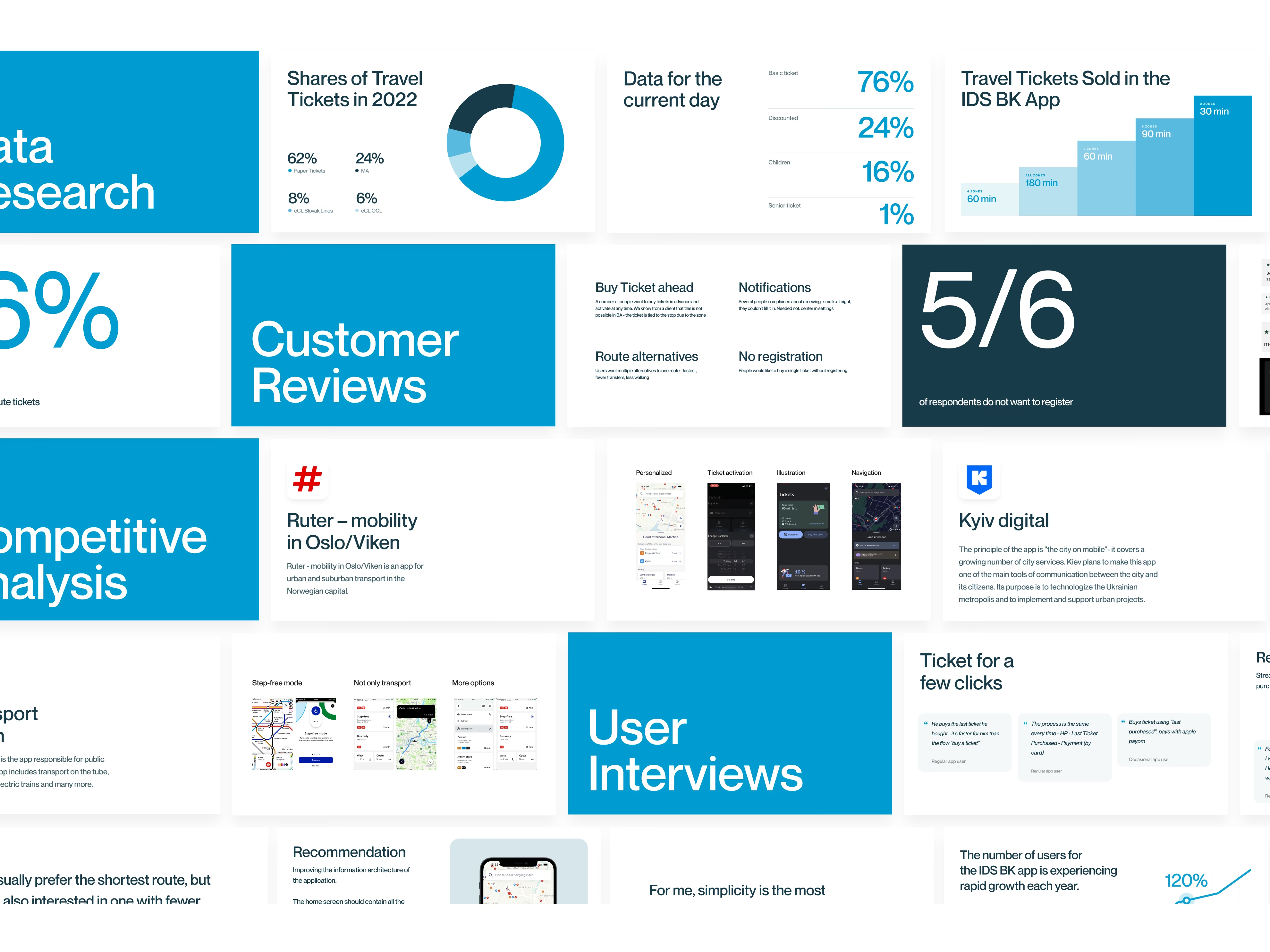
Research
UX/UI design
Usability testing
Design system
UX/UI design
Usability testing
Design system
Client
IDS BK
Timeframe
4 months
IDS BK, the Integrated Transport System of the Bratislava Region, connects multiple transport operators and modes under one regional mobility system, allowing passengers to travel with a single ticket across the network.
Our work focused on redesigning the IDS BK app so that this integrated service became easier to use in everyday life. Through research, usability testing, and design, we helped turn an aging and inconsistent app into a clearer, faster, and more intuitive experience built around how people actually travel.
Our work focused on redesigning the IDS BK app so that this integrated service became easier to use in everyday life. Through research, usability testing, and design, we helped turn an aging and inconsistent app into a clearer, faster, and more intuitive experience built around how people actually travel.
Key outcomes
- Research-led redesign based on analytics, interviews, and testing
- 30 user interviews & quantitative questionnaire
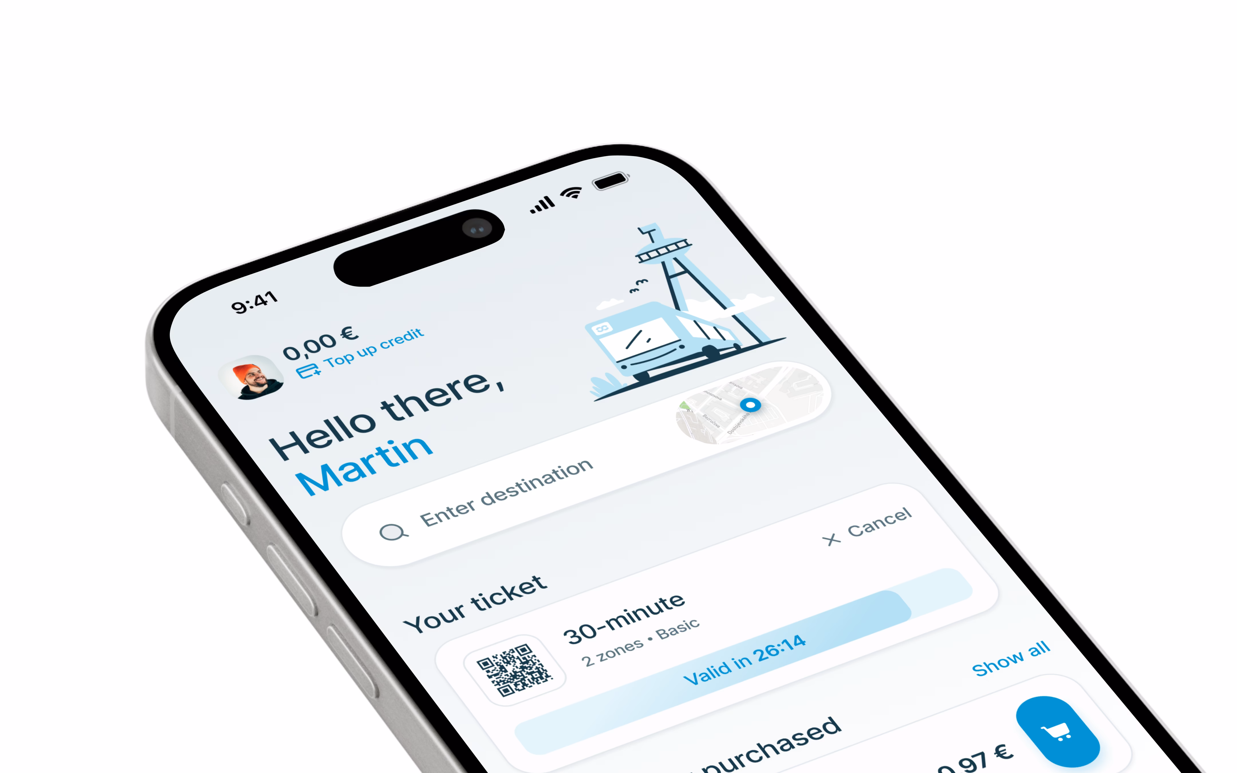
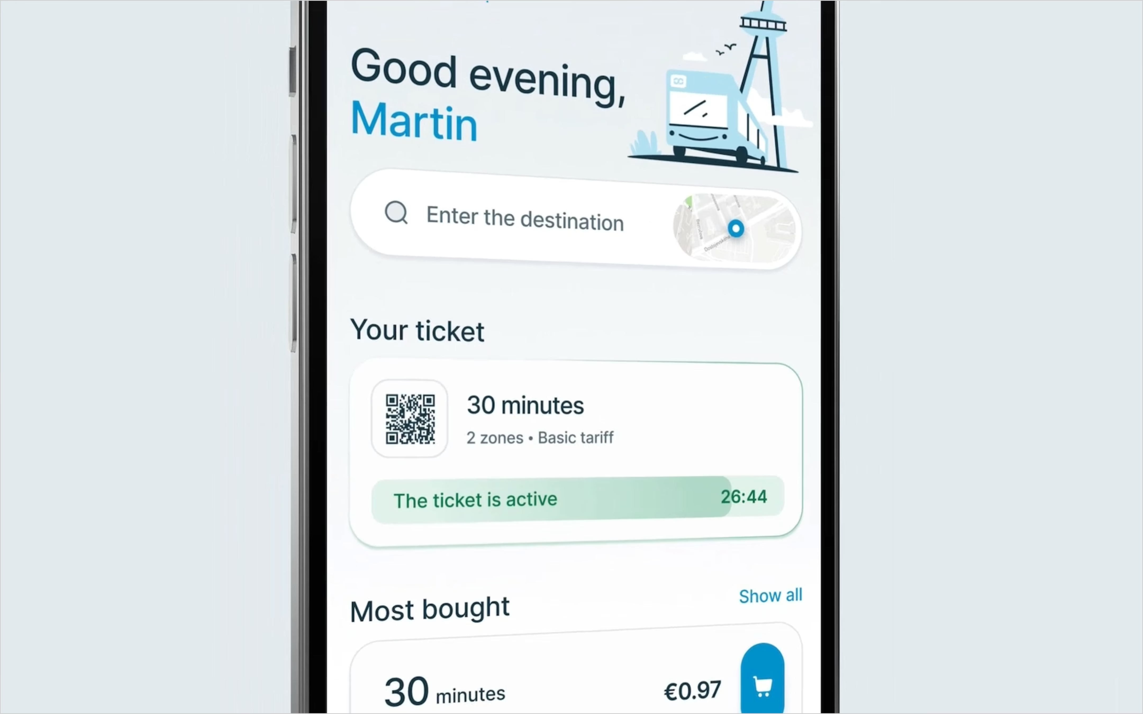
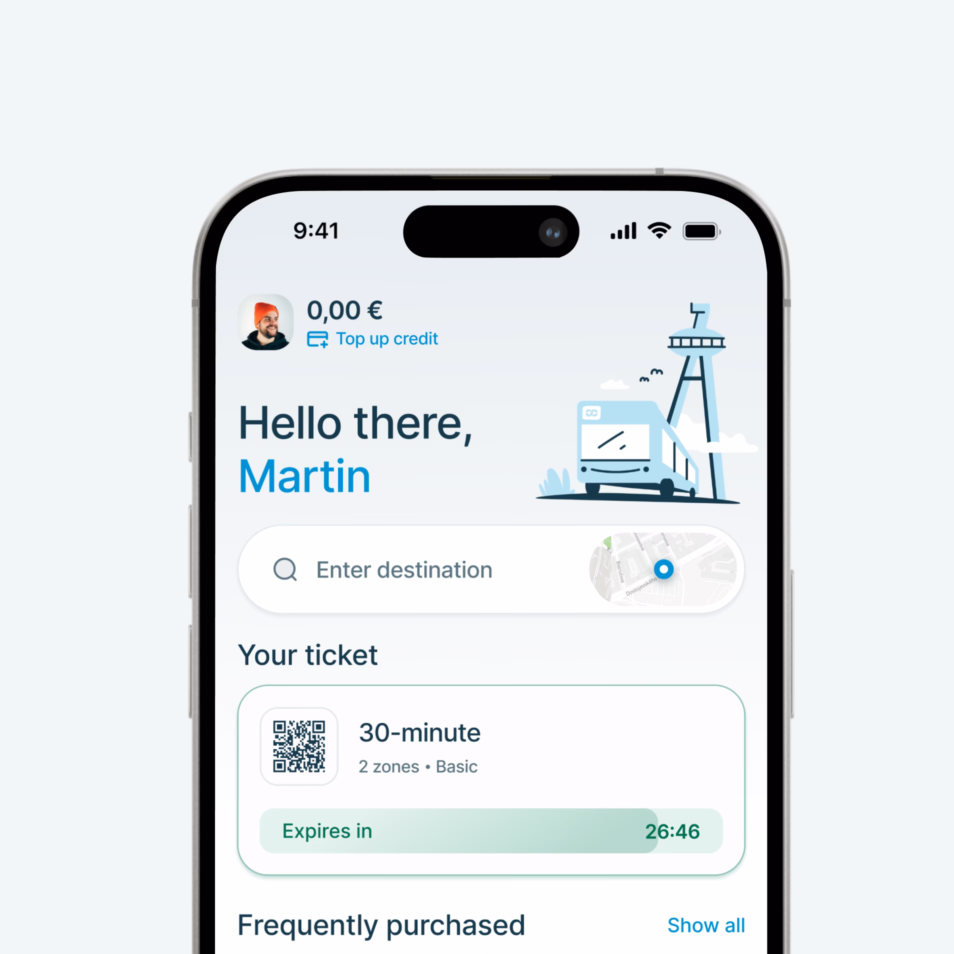
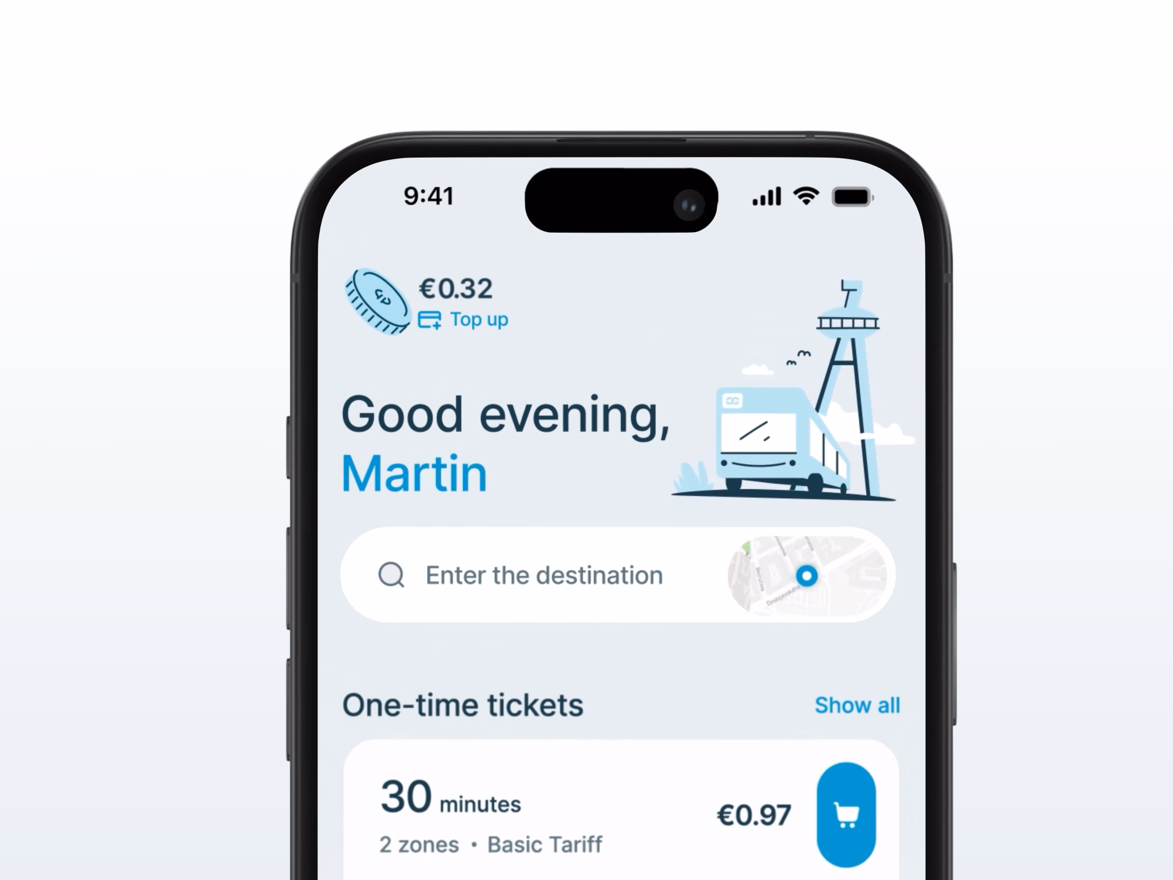
- Faster ticket purchase and a more useful home screen
- Simpler access without mandatory registration
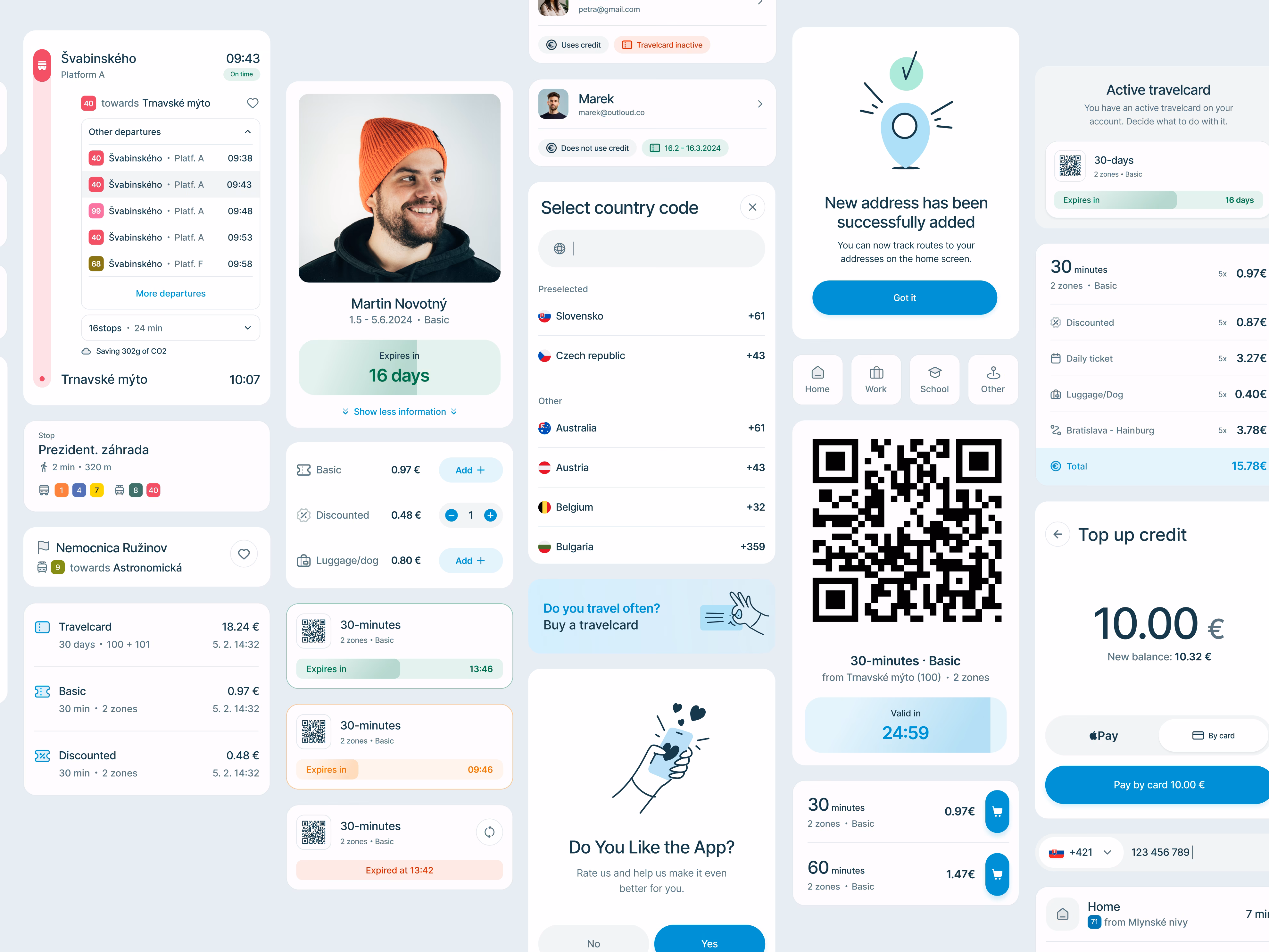
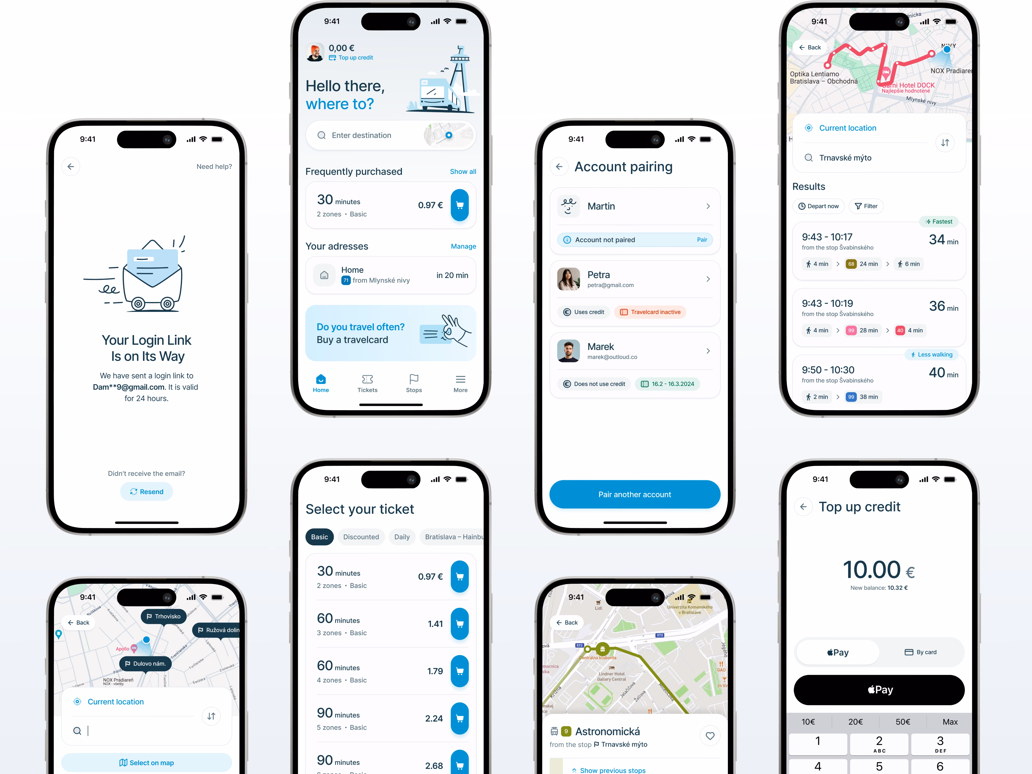
- 500+ unique screens designed in Light and Dark mode
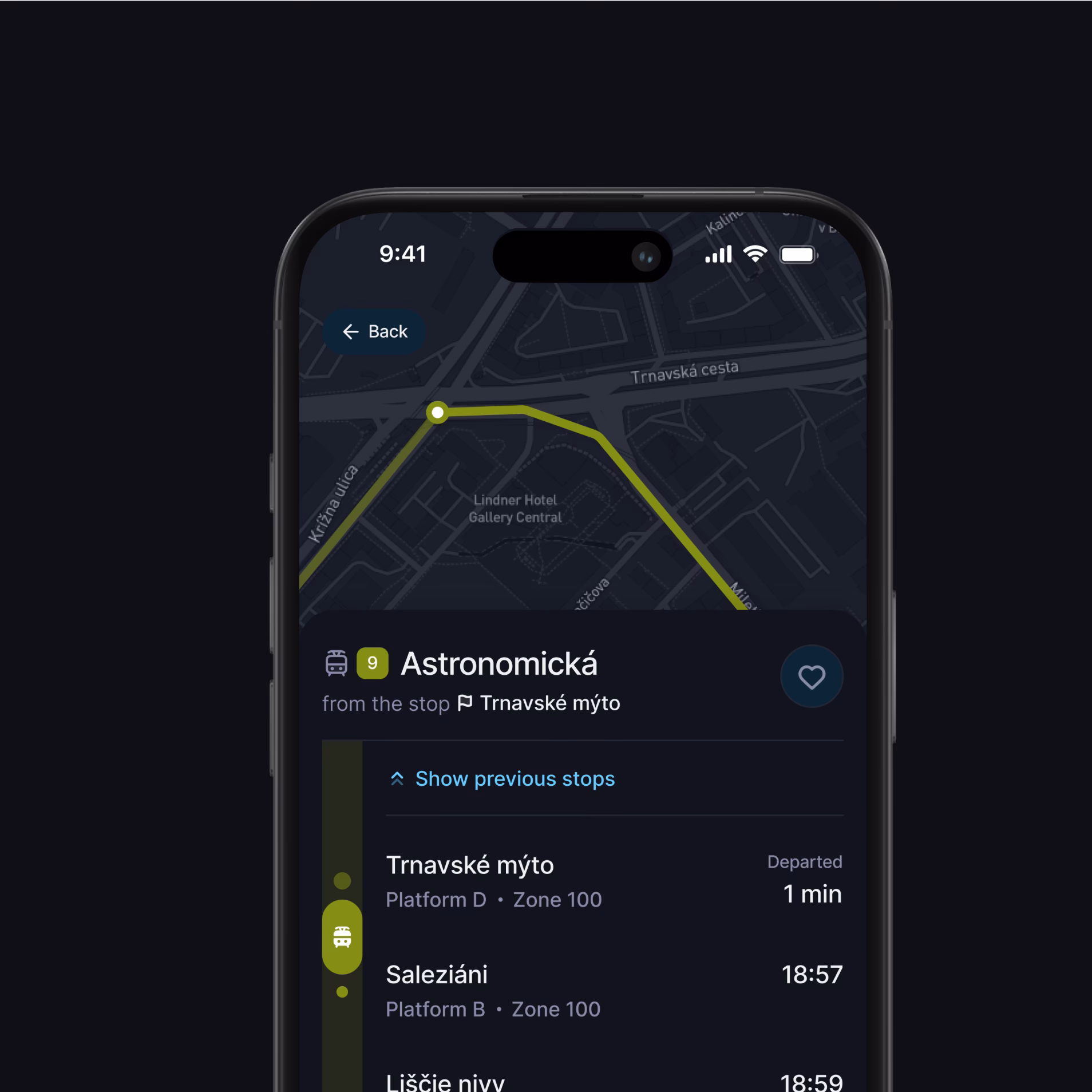
Rooted in interviews, testing, and real travel patterns
Designed for very different kinds of passengers
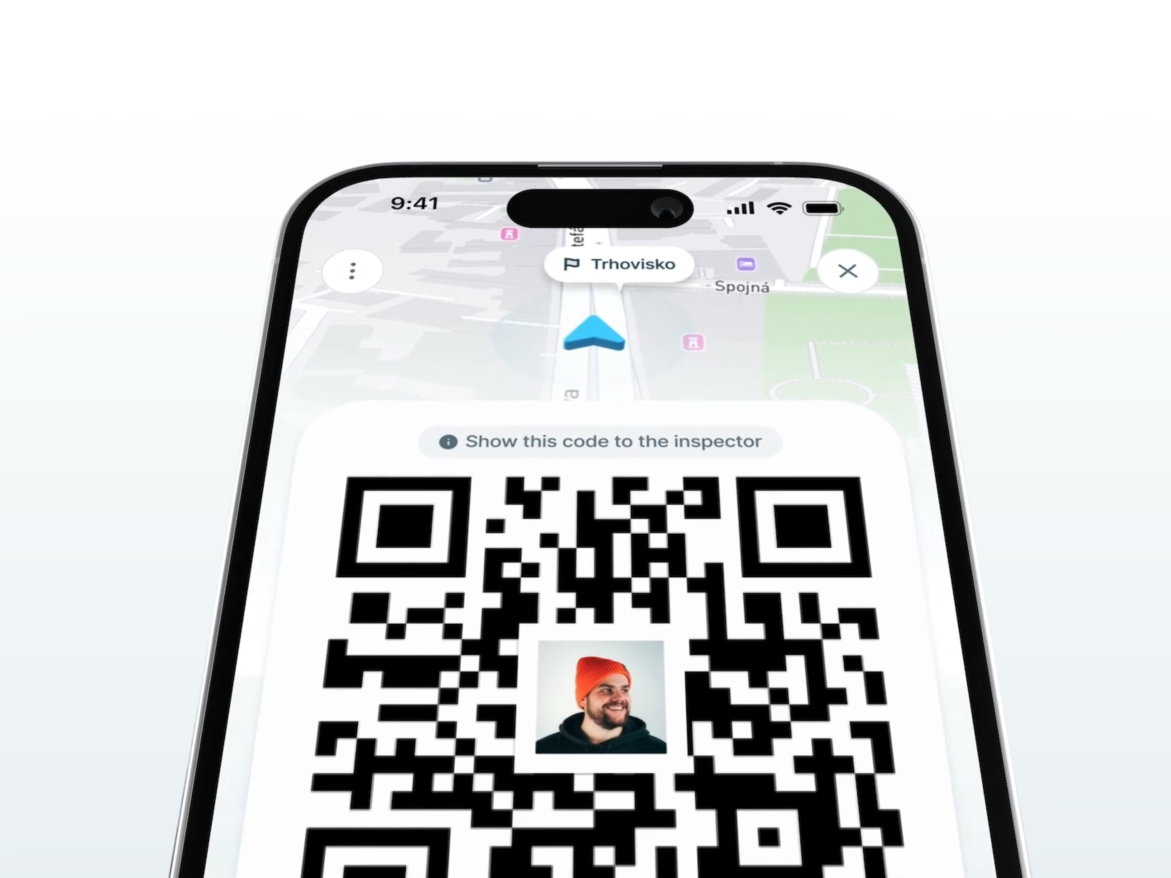
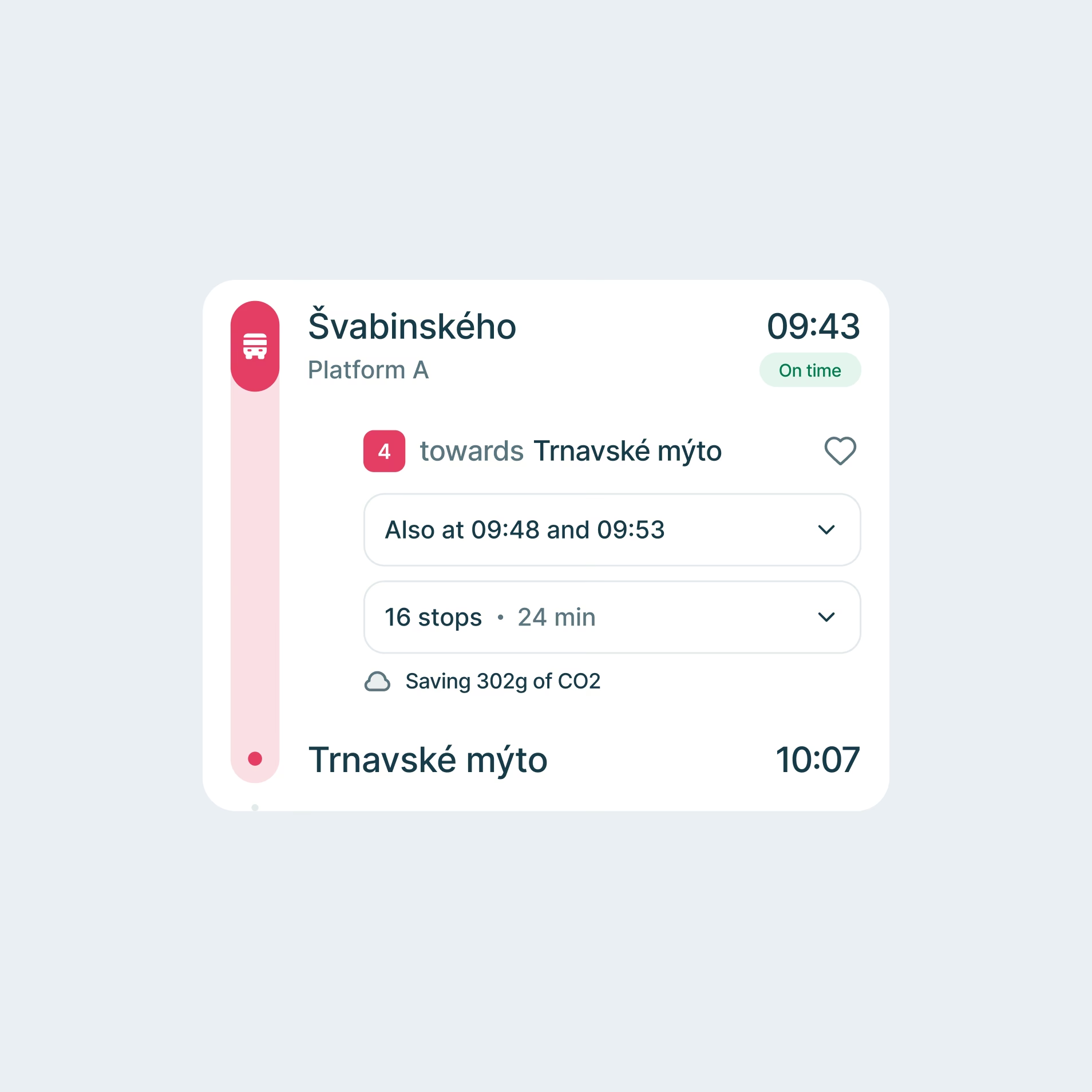

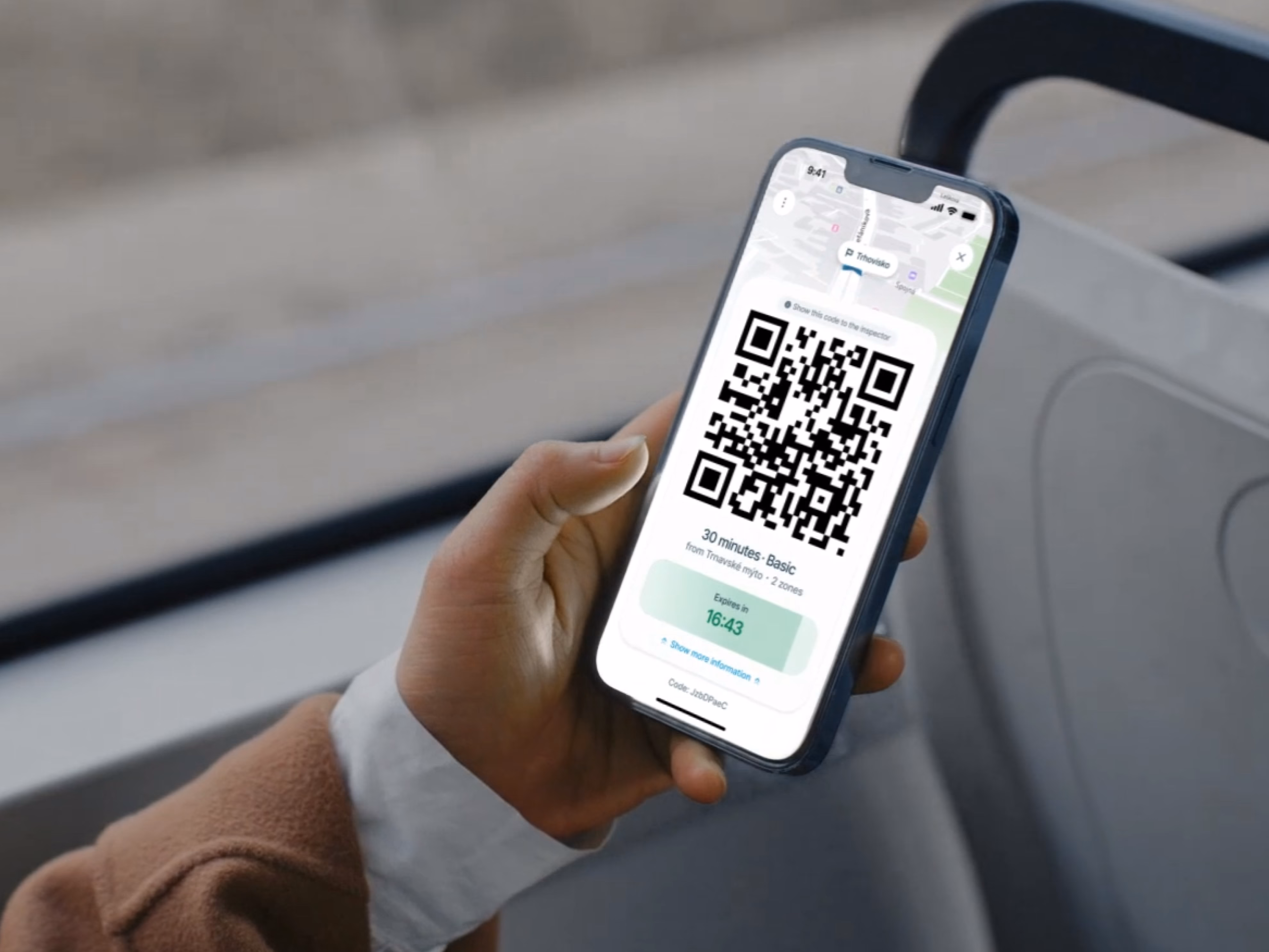
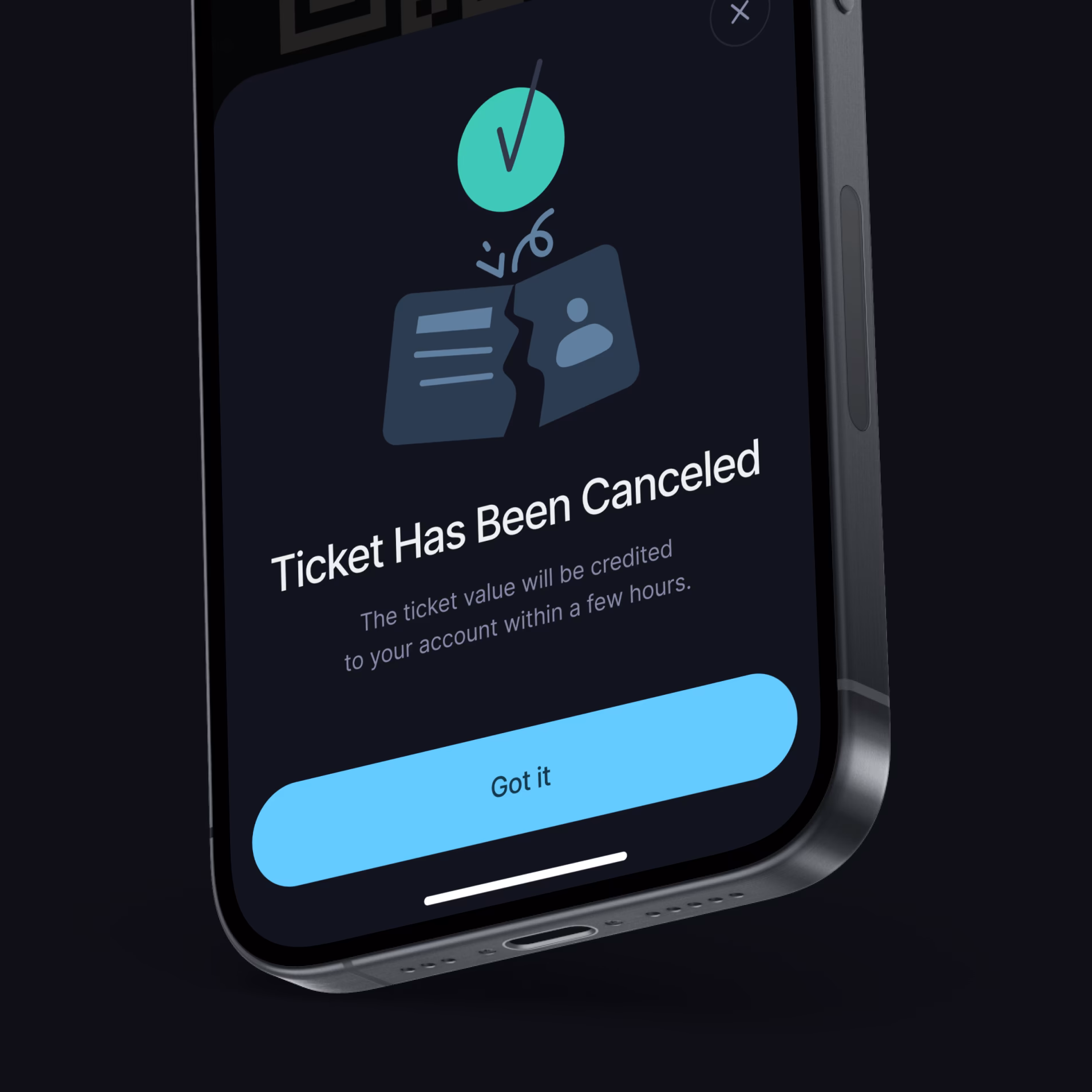
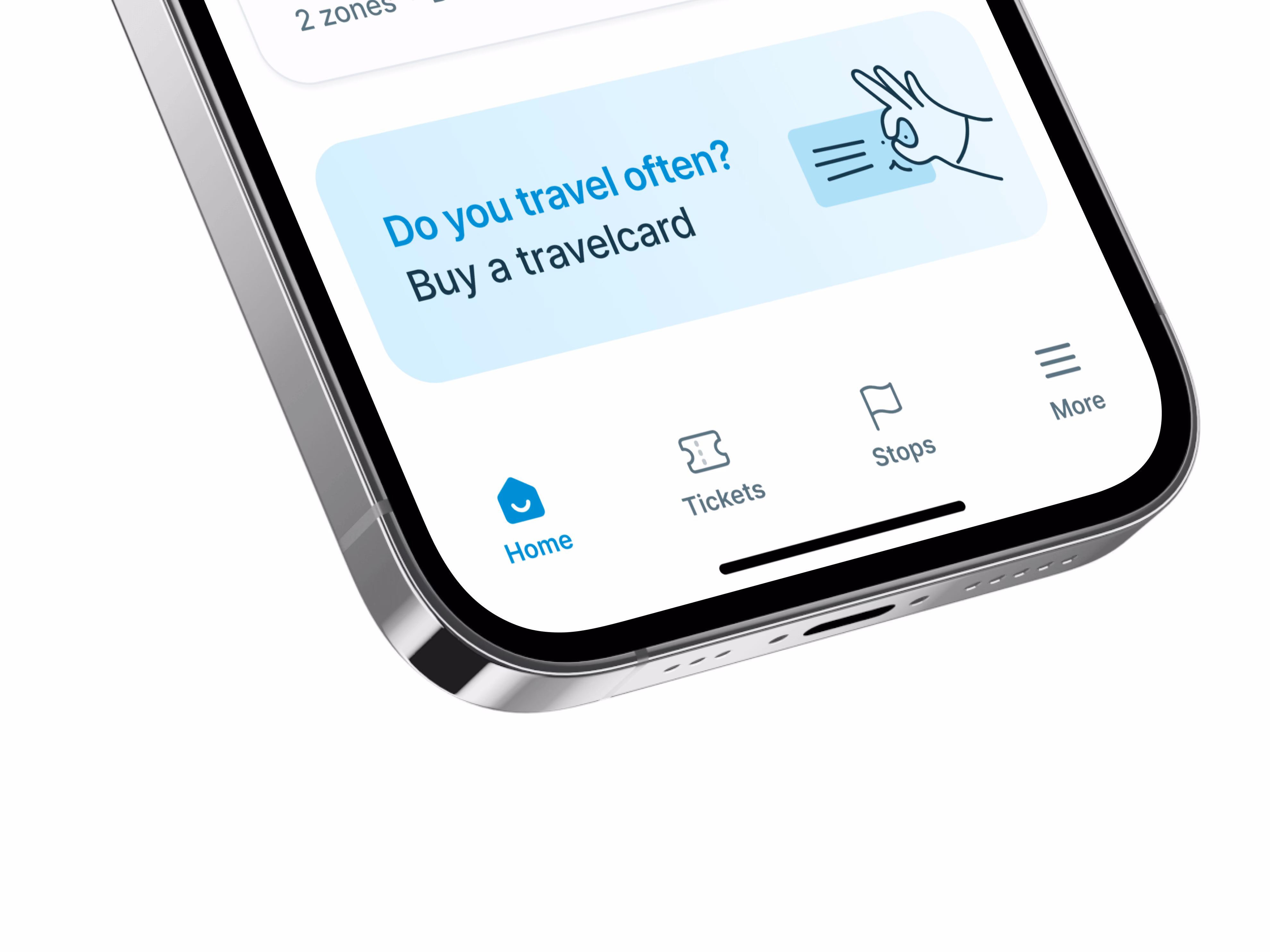
Making access and ticket purchase faster
From research insights to a reusable design system.
At kickoff, the client presented requirements that couldn't fit the timeframe. The first real deliverable was a realistic roadmap with clear priority tiers.
We ran two parallel discovery streams and shaped an MVP definition with Sales stakeholders, focused on a product useful from day one.
We ran two parallel discovery streams and shaped an MVP definition with Sales stakeholders, focused on a product useful from day one.
Research
& Wireframe Validation
The process started with analytics review, competitor analysis, and interviews across different passenger groups, from students to retirees.
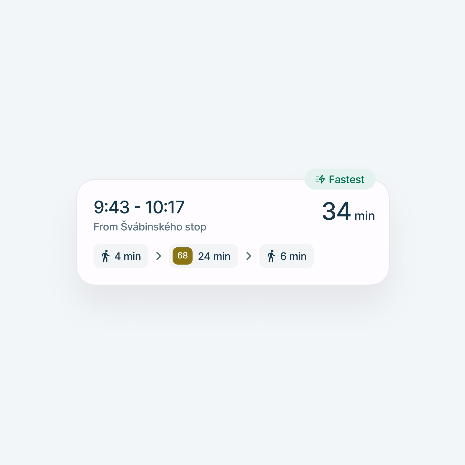
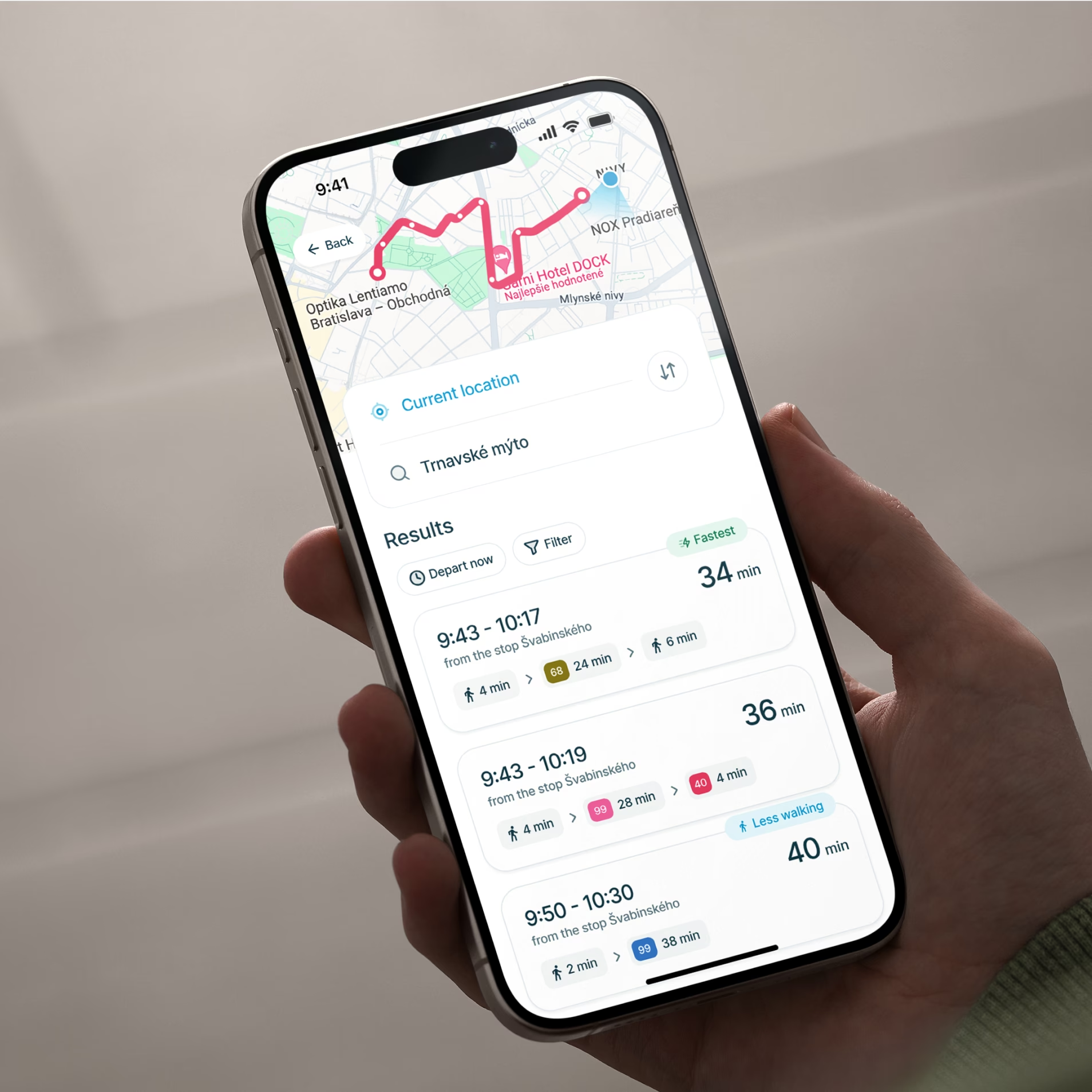
Those insights were then tested on wireframes before final UI work began, helping validate key journeys such as ticket purchase, route search, and registration-related flows early and more efficiently.
Those insights were then tested on wireframes before final UI work began, helping validate key journeys such as ticket purchase, route search, and registration-related flows early and more efficiently.
Design System as the Product Backbone
Once the core flows were validated, the next step was to turn them into a reusable design language. The design system gave the app a shared set of components, interaction patterns, and rules.
Instead of solving each screen separately, it made usability improvements more consistent, repeatable, and easier to maintain over time.
Instead of solving each screen separately, it made usability improvements more consistent, repeatable, and easier to maintain over time.
Scaling the Interface Consistently
With the design system in place, the redesign could expand into a large screen set while staying visually and functionally coherent.
The final output covered more than 500 unique screens in both Light and Dark mode, giving the client not just a refreshed interface, but a structured design foundation for future iteration.
The final output covered more than 500 unique screens in both Light and Dark mode, giving the client not just a refreshed interface, but a structured design foundation for future iteration.
Built around repeated routes and repeated choices
"What impressed us most about this company was their exceptional creative thinking and the innovative ideas they brought to the table.
They demonstrated a unique ability to translate our specific requirements into practical yet imaginative solutions."
Research is only valuable when it scales into the product.
For IDS BK, the work did not end with interviews, wireframes, or isolated UX fixes.
The challenge was to turn research findings into a product system that could stay coherent across hundreds of screens, repeated travel scenarios, and future iterations.
That is where the design system mattered. It helped translate insights about how people actually travel into reusable components, clearer interaction patterns, and a stronger foundation for consistent design decisions across the app.
500+
Unique screens designed in Light and Dark mode
30
User Interviews
200h
Of research