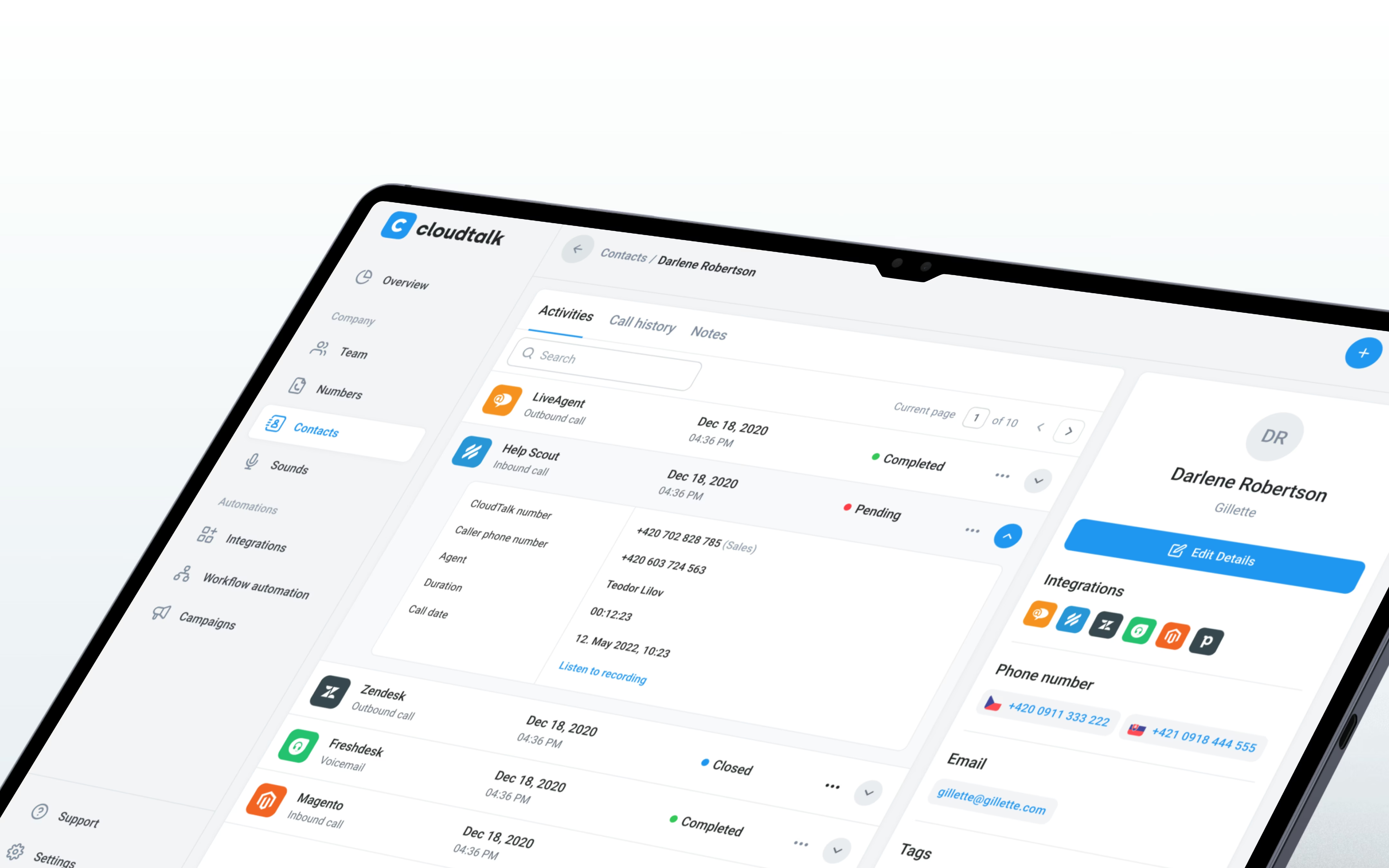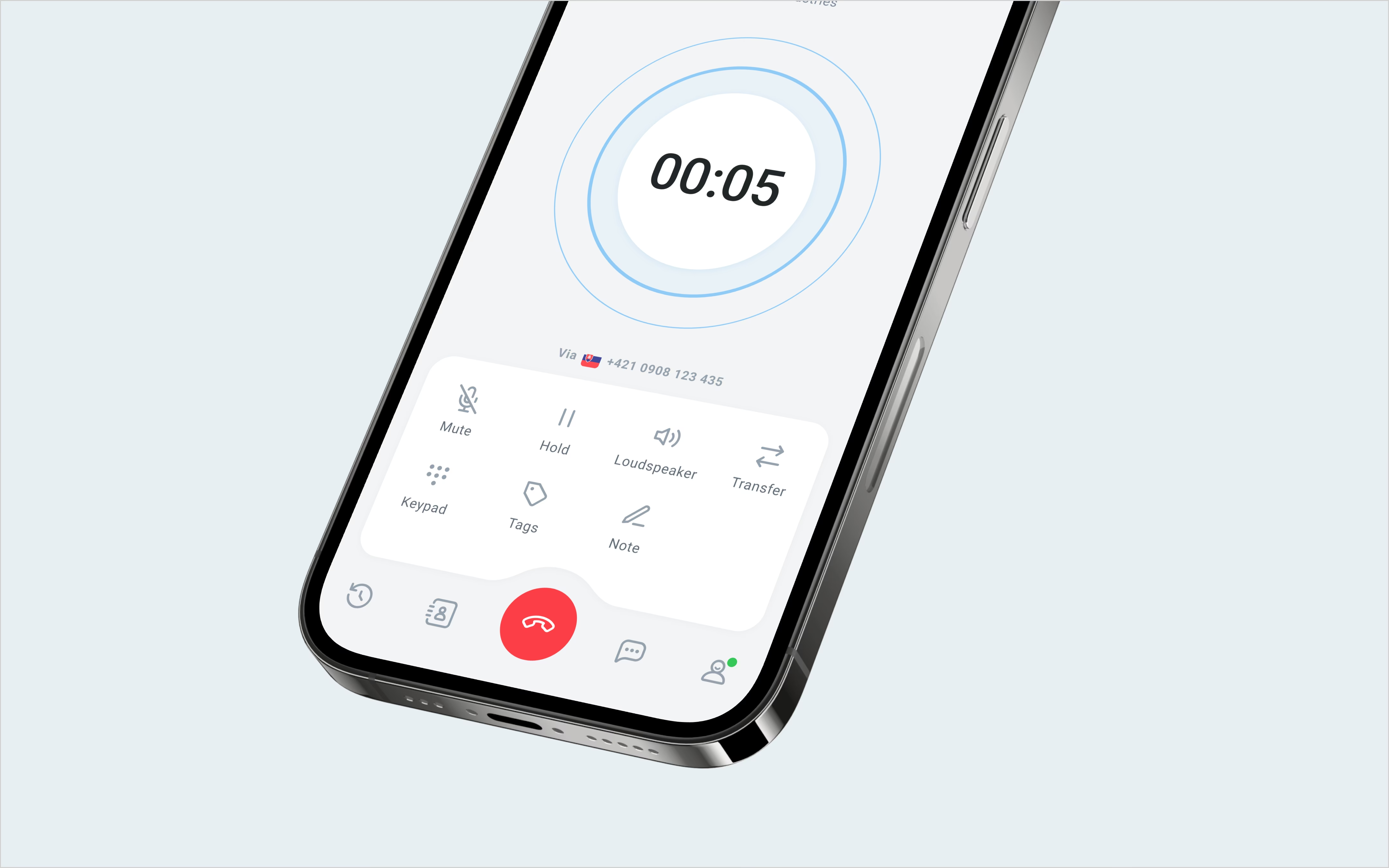
Clearer tools for every call.
Users can reach important information and controls more easily, while CloudTalk’s product team has consistent patterns to build on as the platform grows.
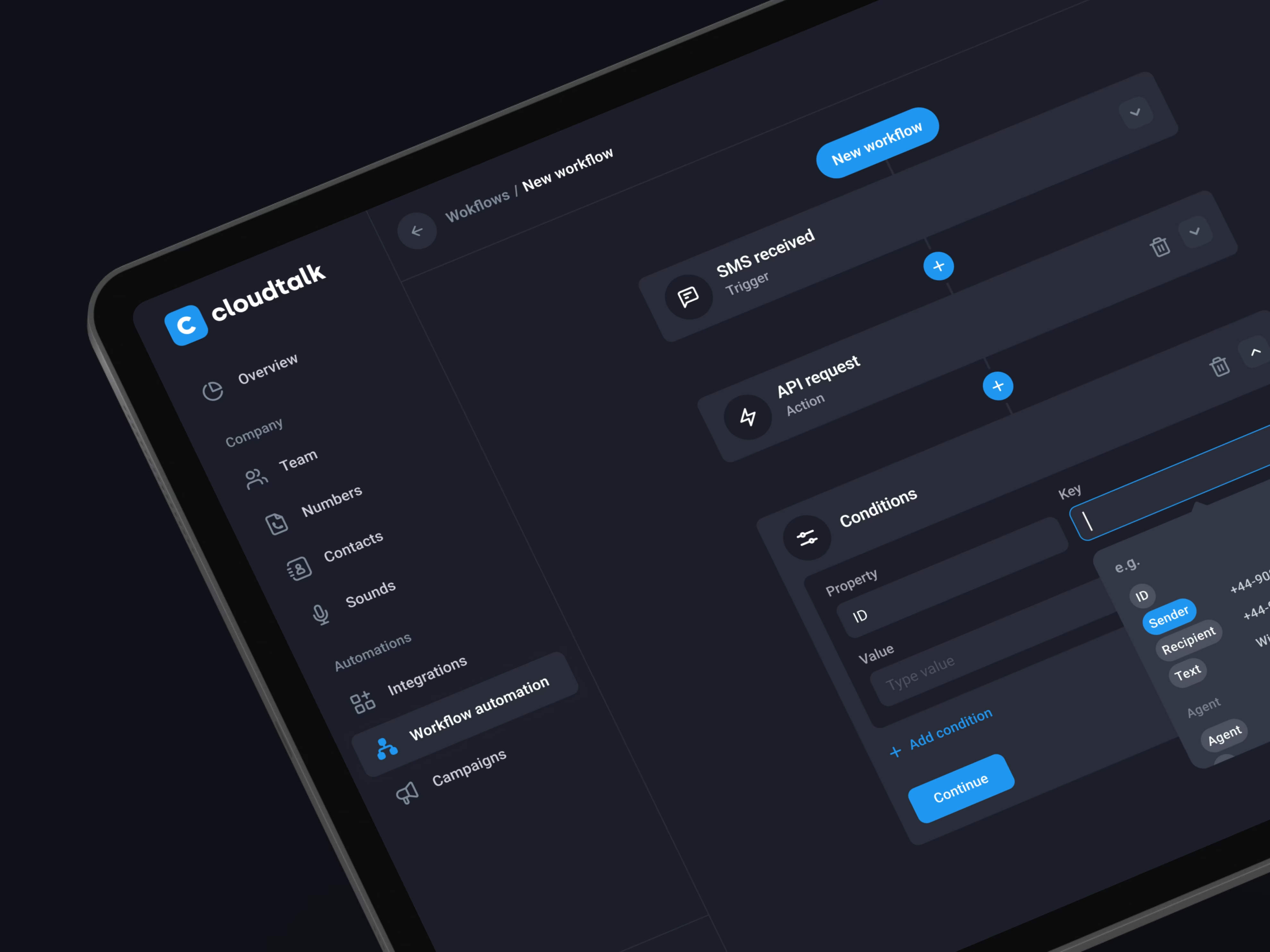
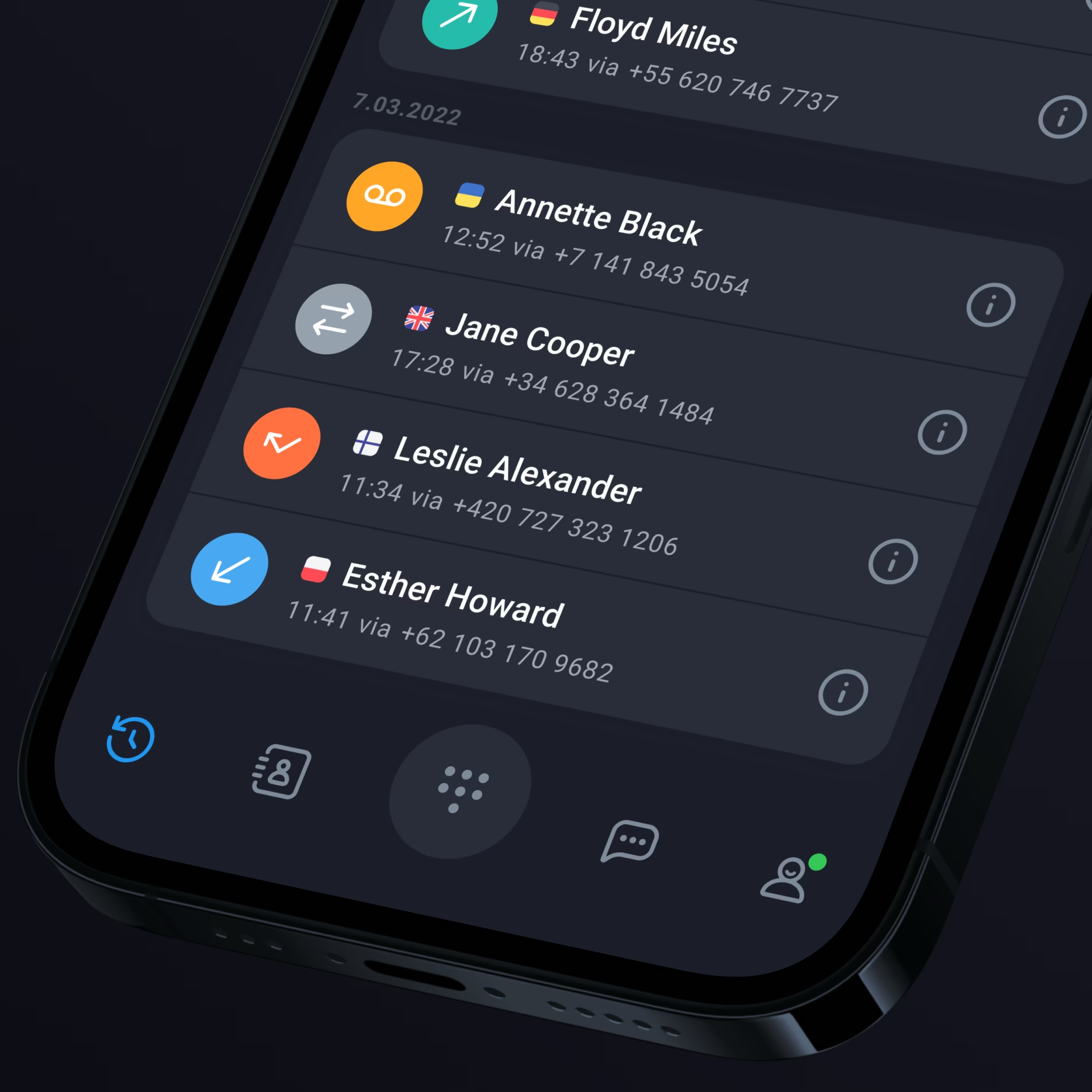
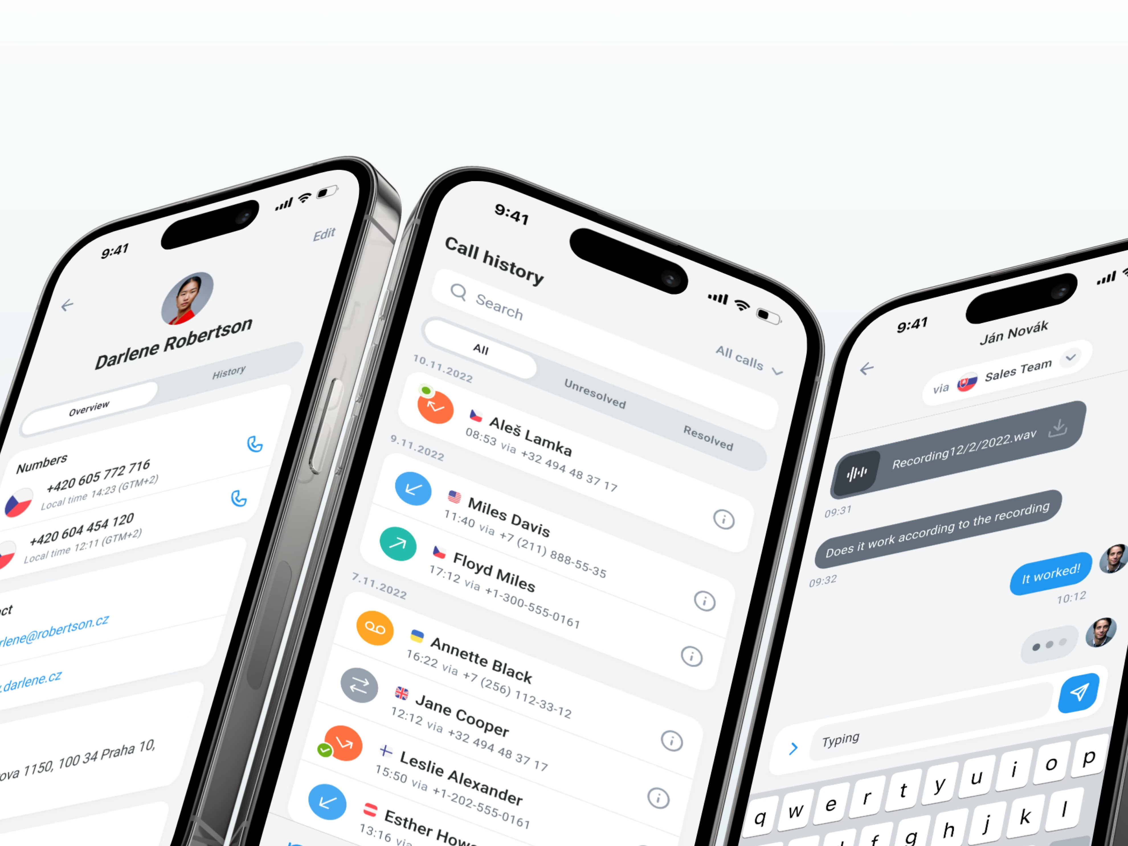
- Desktop and mobile experiences redesigned
- 450+ screens designed
- Consistent navigation and interaction patterns
- A shared design system for future features
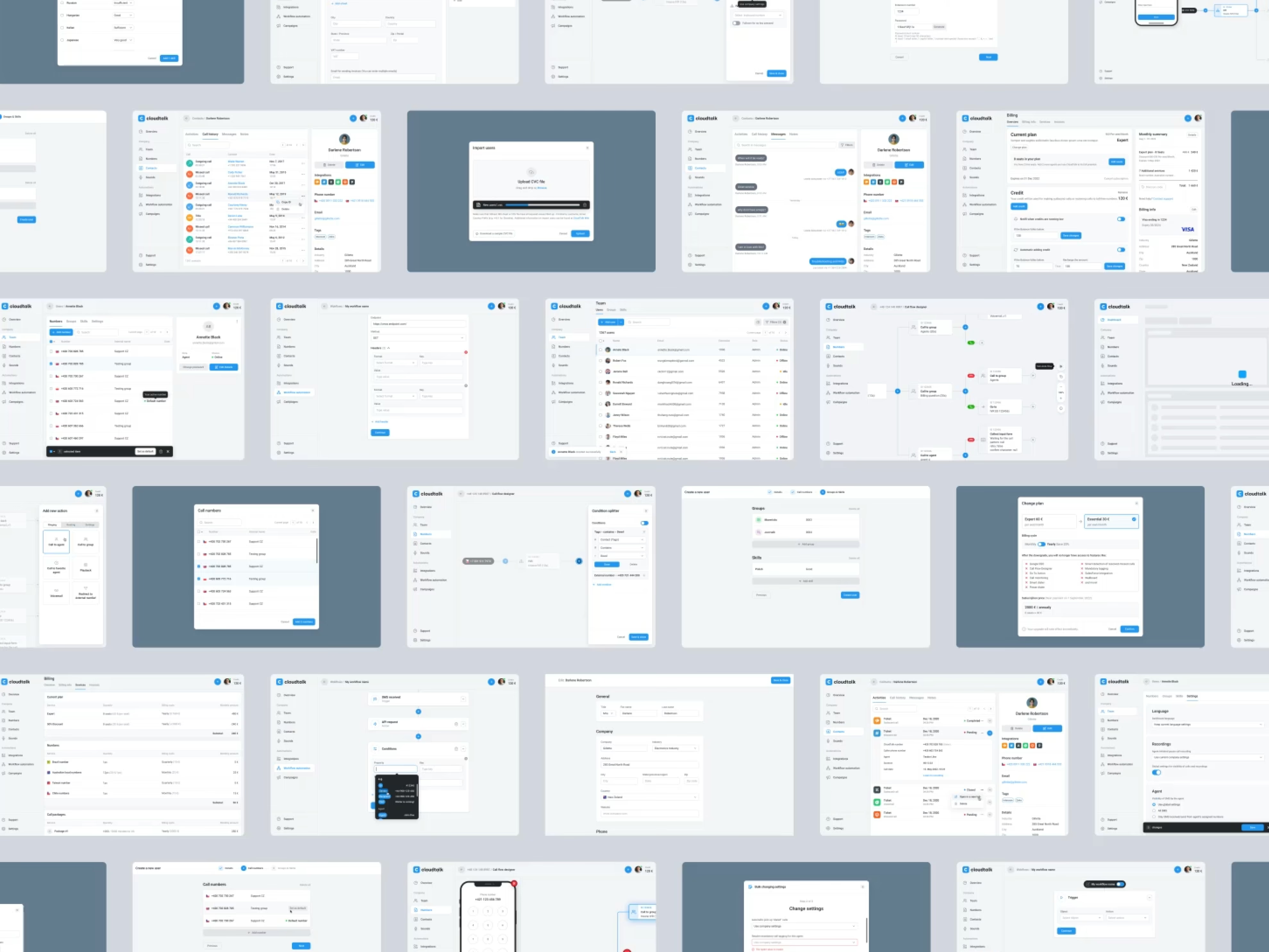
Made daily call workflows easier to navigate.
CloudTalk was an active product with an established user base. The redesign needed to improve daily work while fitting the team’s ongoing release plans.
We worked with CloudTalk to prioritise the areas that needed attention and refine them alongside the product roadmap. Familiar workflows gave us a starting point for clearer, more consistent design.
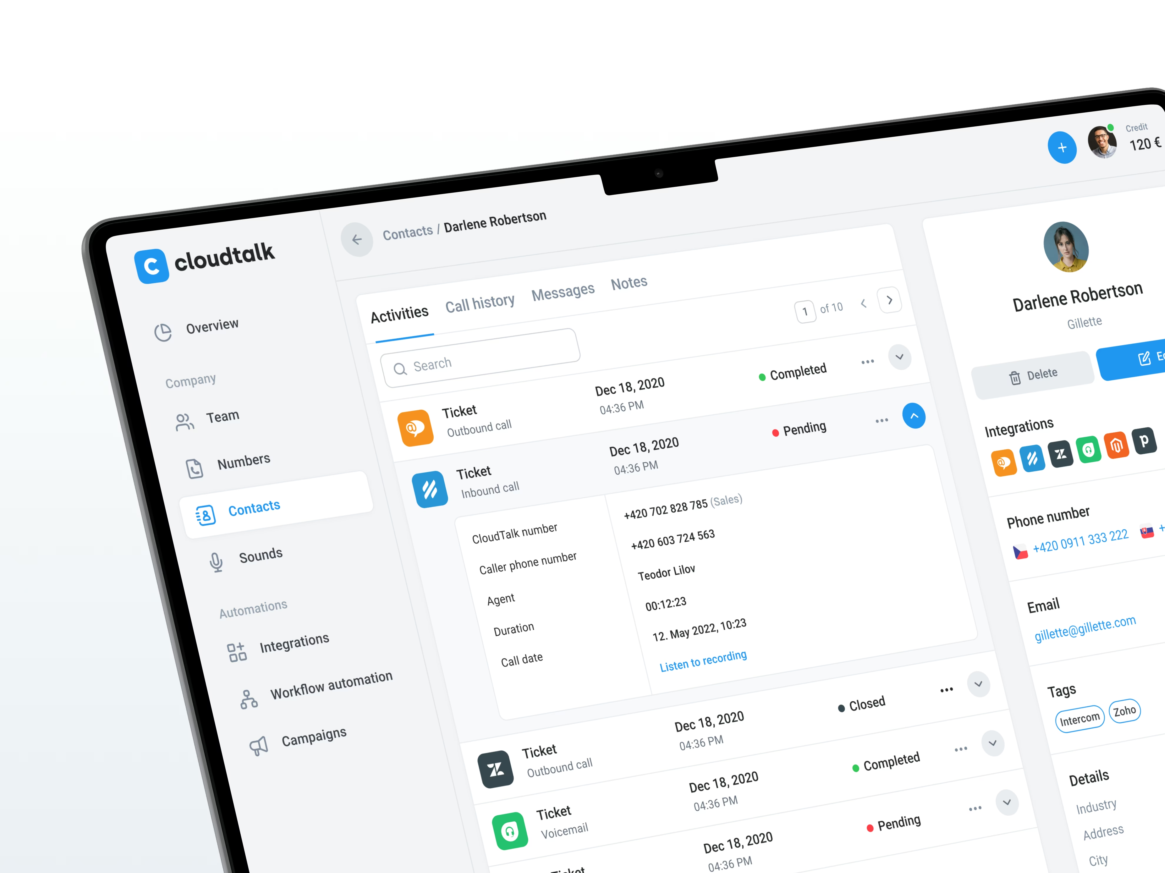

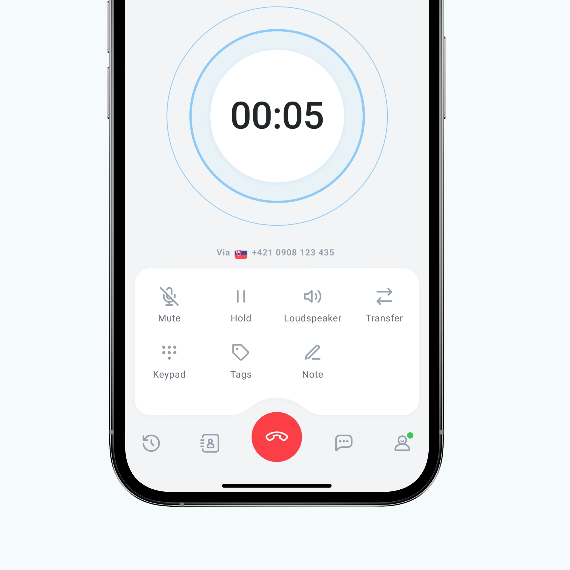
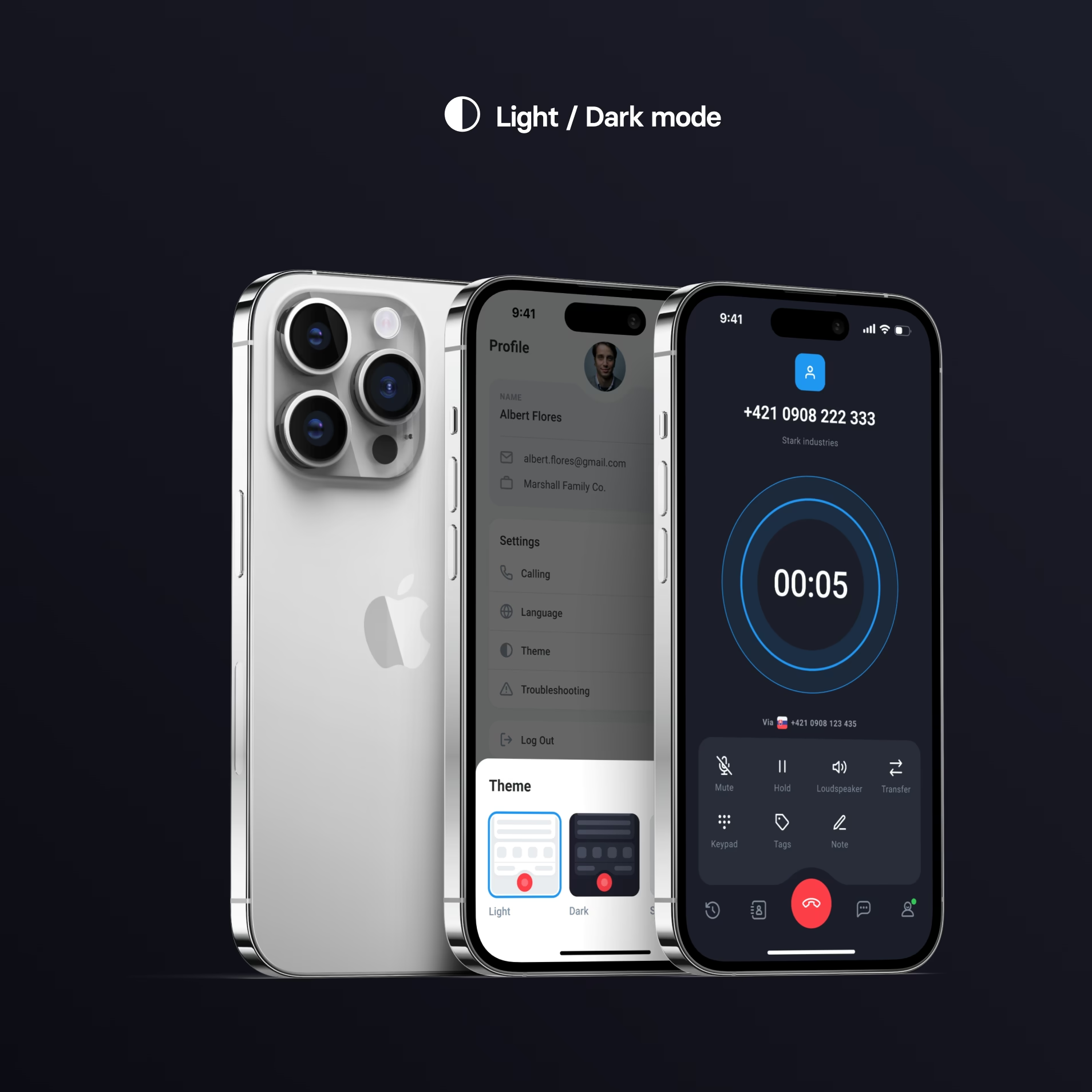
Reduced the learning curve with consistent desktop and mobile designs.
Users should not have to learn a different product when they move between desktop and mobile. We created shared patterns for both.
The design system gives CloudTalk reusable components and interaction rules. Its team can apply them to new features while keeping the experience consistent with the rest of the product.
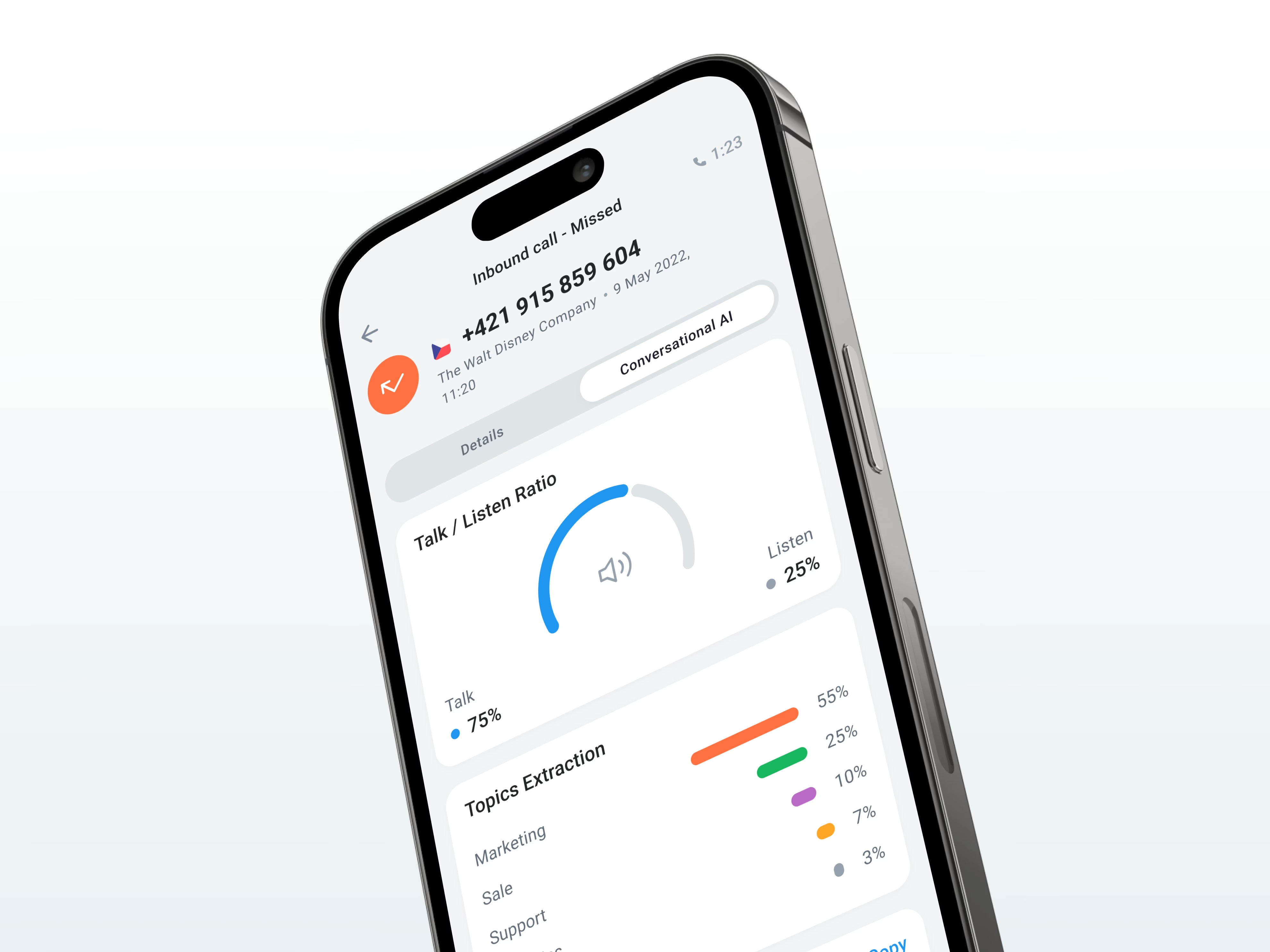
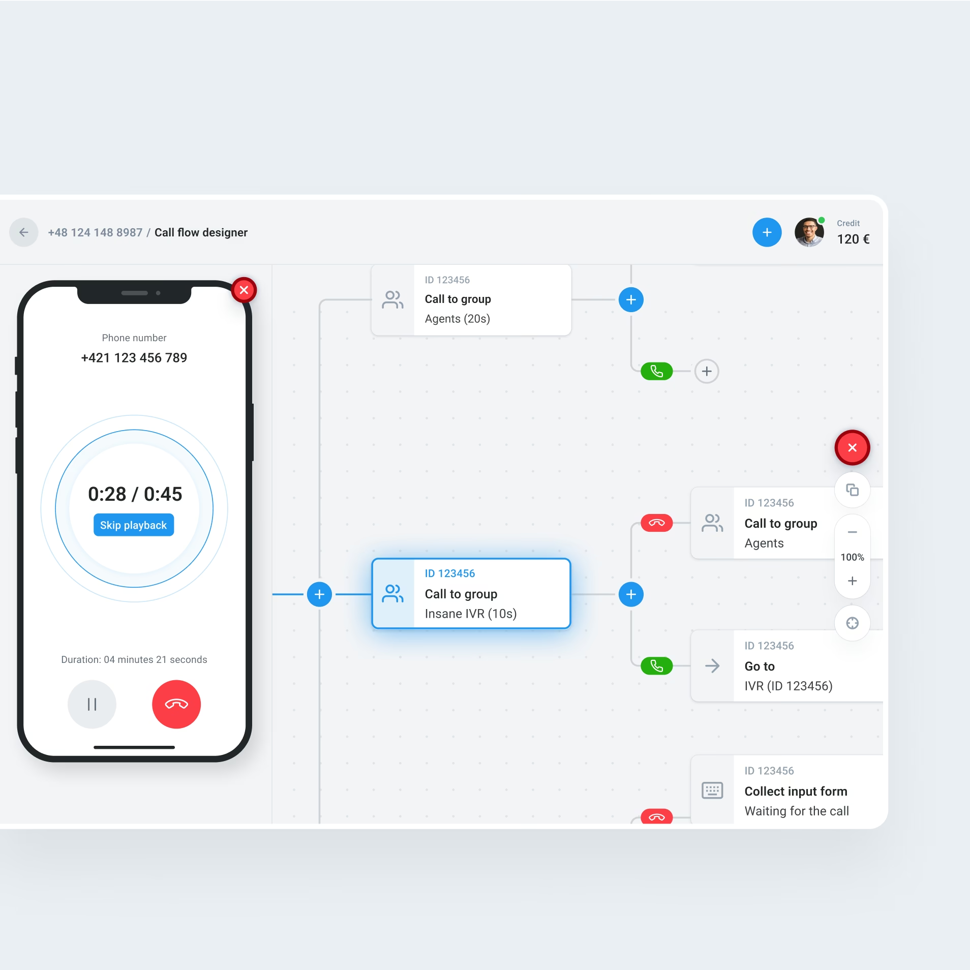

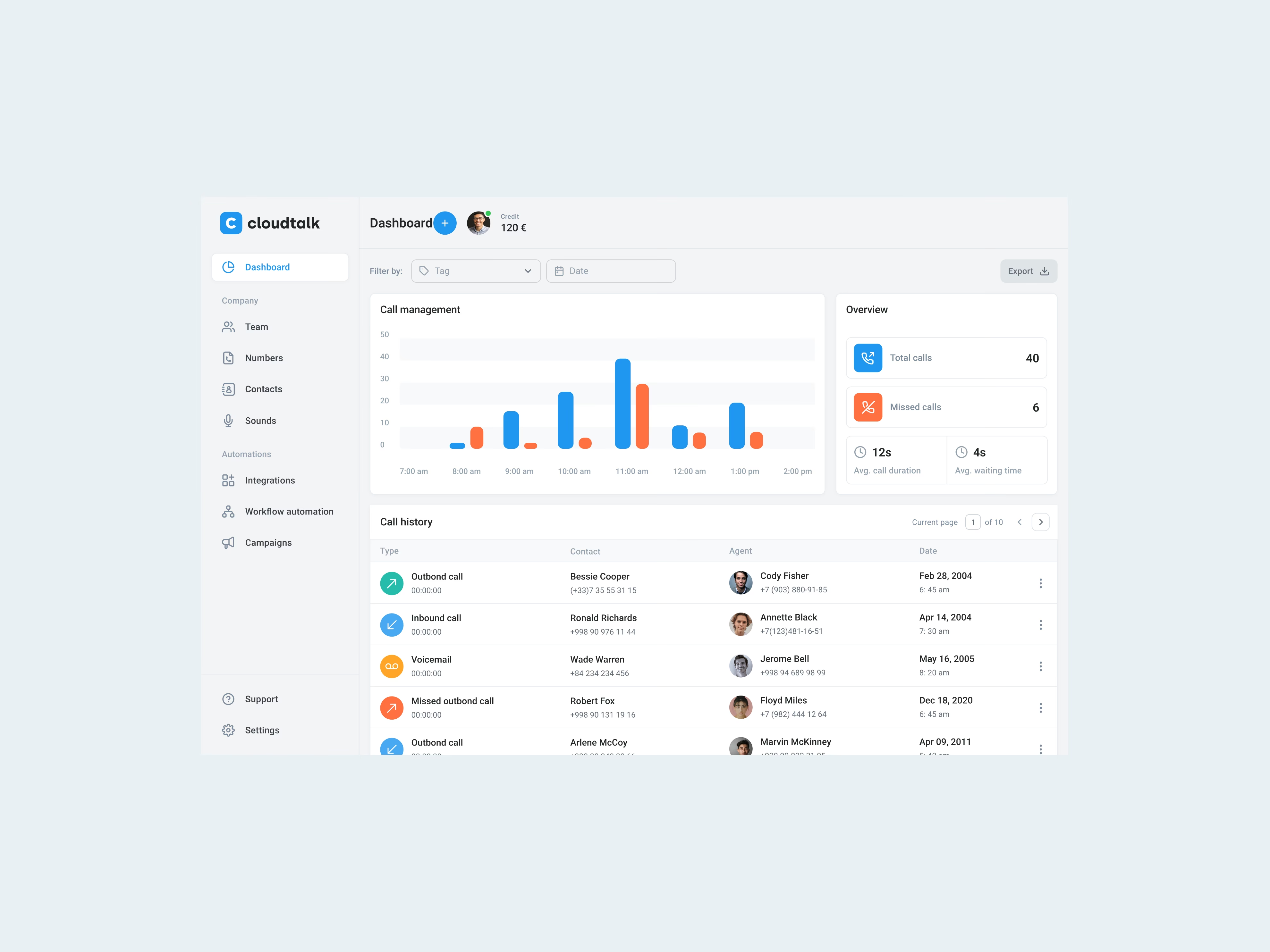
Made call information easier to find, keeping attention on customers.
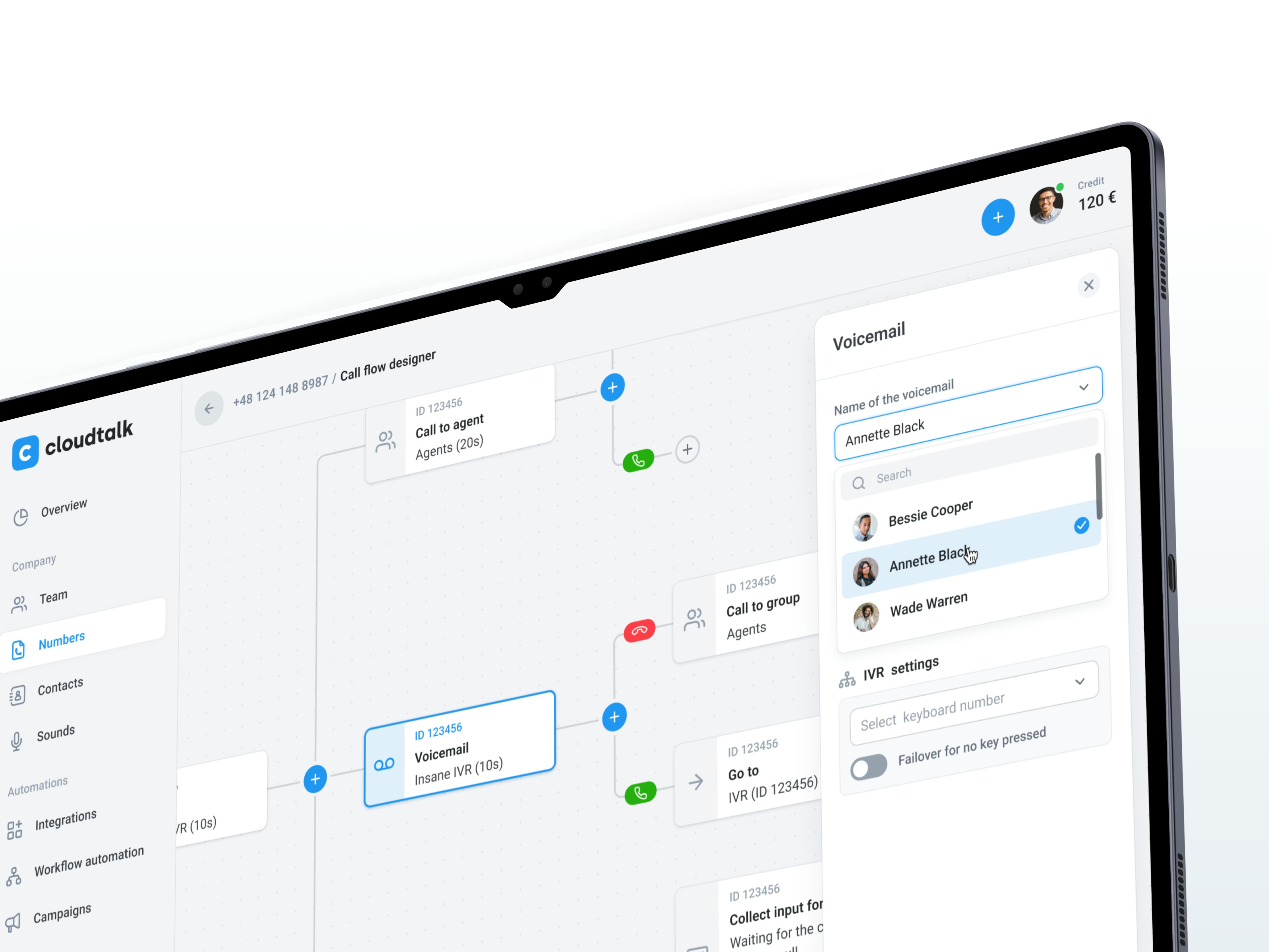
Busy call workflows leave little room for searching through an interface. We brought structure to the screens so key information and actions were easier to find.
Clear hierarchy, navigation, and consistent controls shaped the redesign. Each screen needed to support the next action without asking users to work out a new pattern.
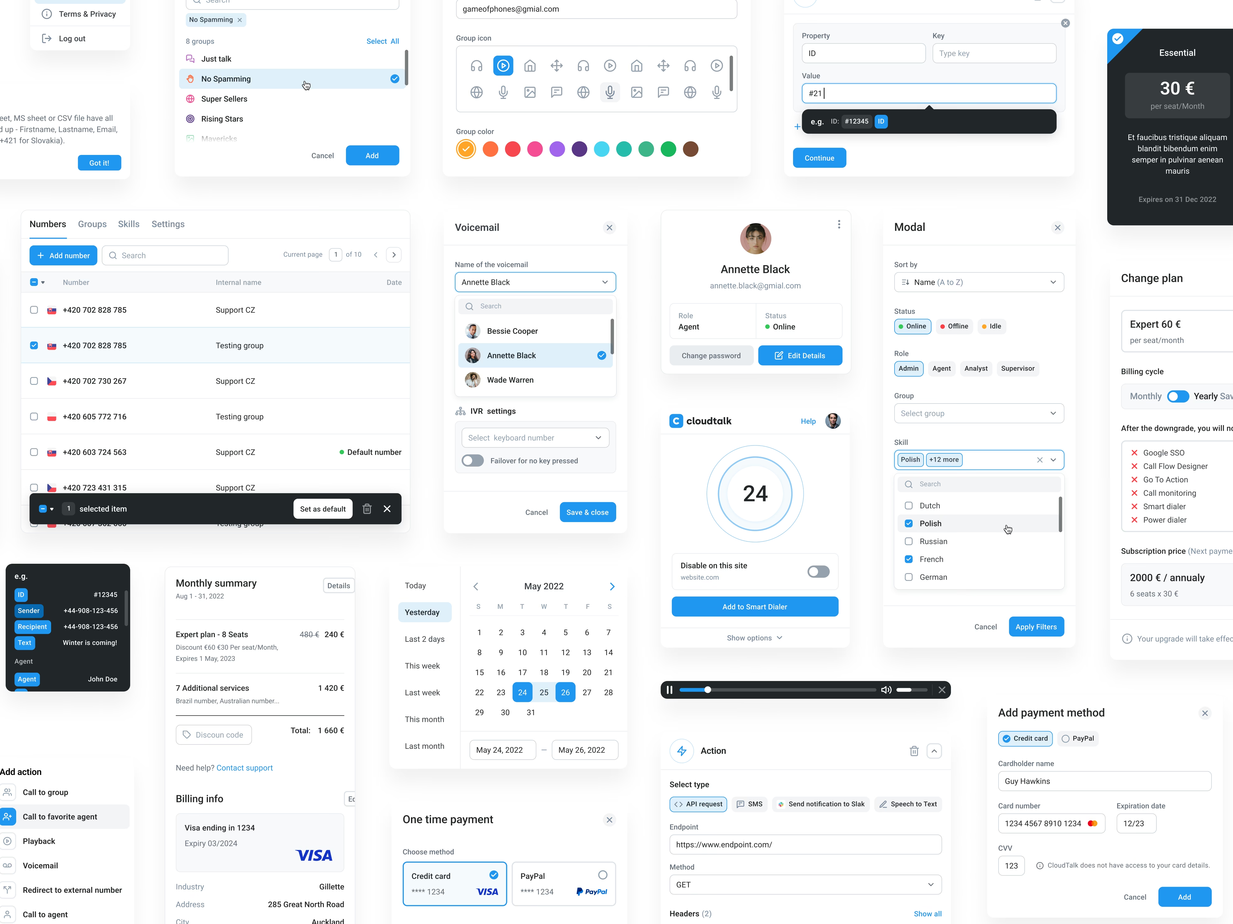
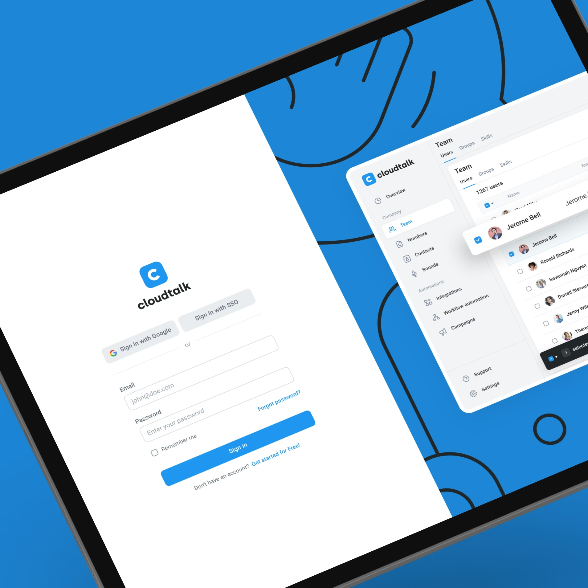
Helped the product team move from ideas to build-ready designs.
Understand the work
Design the experience
Support what comes next
Made the next step clearer with useful on-screen feedback.
Feedback after a click helps people understand what happened and what to do next. We used small interactions to make the interface easier to follow.
Movement and state changes guide attention and explain how controls behave. These details support the work without competing with the conversation or information on screen.
"They provided us with a good source of design foundations, fast delivery, and carefully prepared outputs.
I was extremely satisfied that together we created a product that we can be proud of."

Made new features easier to design with reusable components.
Our role focused on product design, working alongside CloudTalk’s team as the platform evolved.