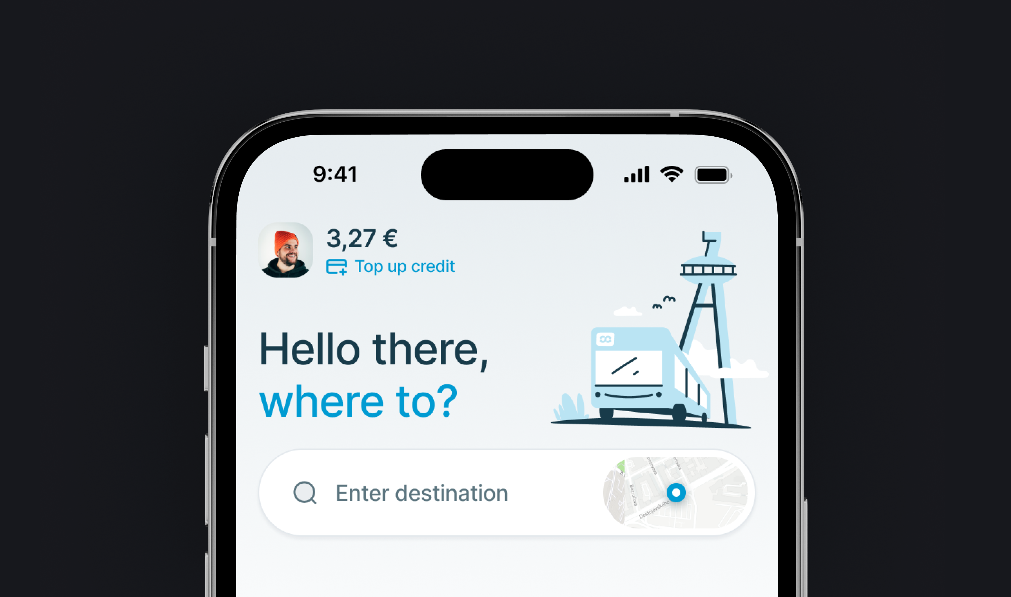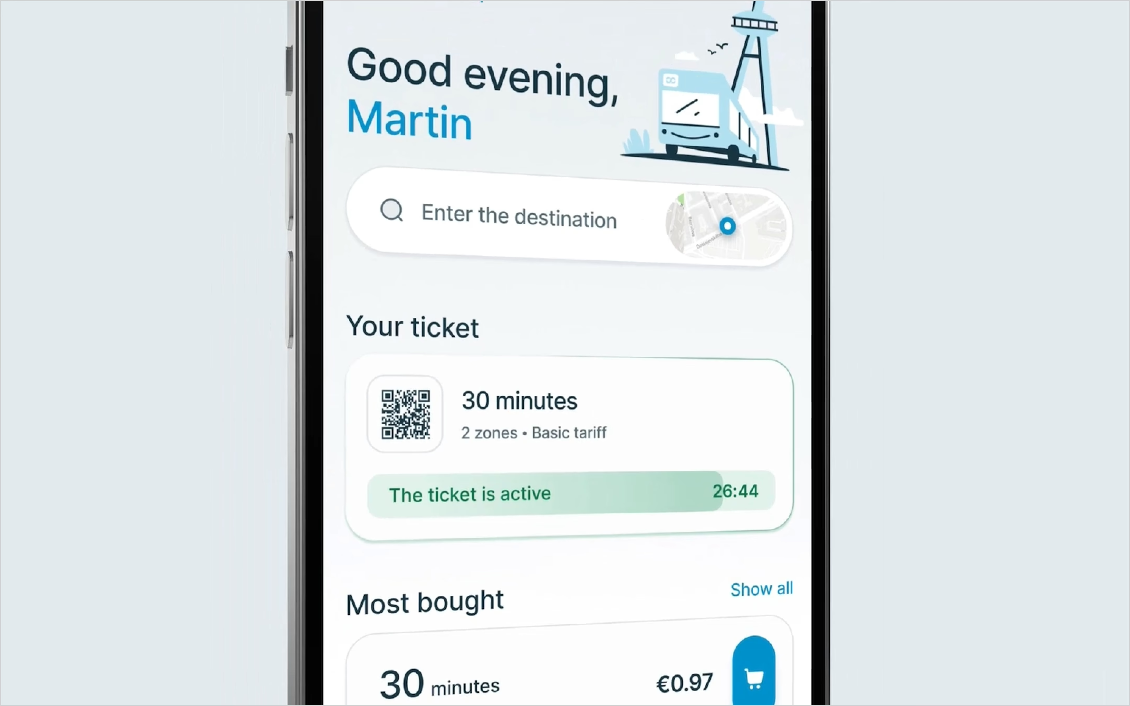
Designed an easier way to travel for IDS BK’s passengers.
IDS BK is the Integrated Transport System of the Bratislava Region. It brings different transport operators and modes together so passengers can travel using a shared ticketing system. Its app helps people find connections and buy the tickets they need.
Outloud’s role was to research and redesign that experience. We delivered passenger research, tested journeys and a complete interface design for the client’s implementation, bringing the most frequent tasks closer to the home screen.
Made repeat ticket purchases possible in two taps.
The redesigned purchase flow lets a returning passenger buy a ticket in two taps using their existing payment choice. Favourite routes, saved addresses and frequently purchased tickets make repeat journeys easier to start. IDS BK received a tested design and a shared design system ready for implementation.
Put frequent journeys within easier reach.
The app had gained features since its original launch in 2018, but the interface had not kept pace. Passengers could buy tickets, yet useful capabilities remained difficult to discover. Improving the visual style alone would leave those problems in place.
We reviewed the existing app, analytics and client reports, compared transport apps, and interviewed occasional riders, regular passengers and people who did not use the app. The research included a broad age range, from students to retirees.
Repeat behaviour stood out: research found that 85% of users repeatedly bought the same ticket. Passengers also described recurring journeys between familiar places. That shifted the design towards shortcuts for real habits, rather than giving every feature equal prominence.
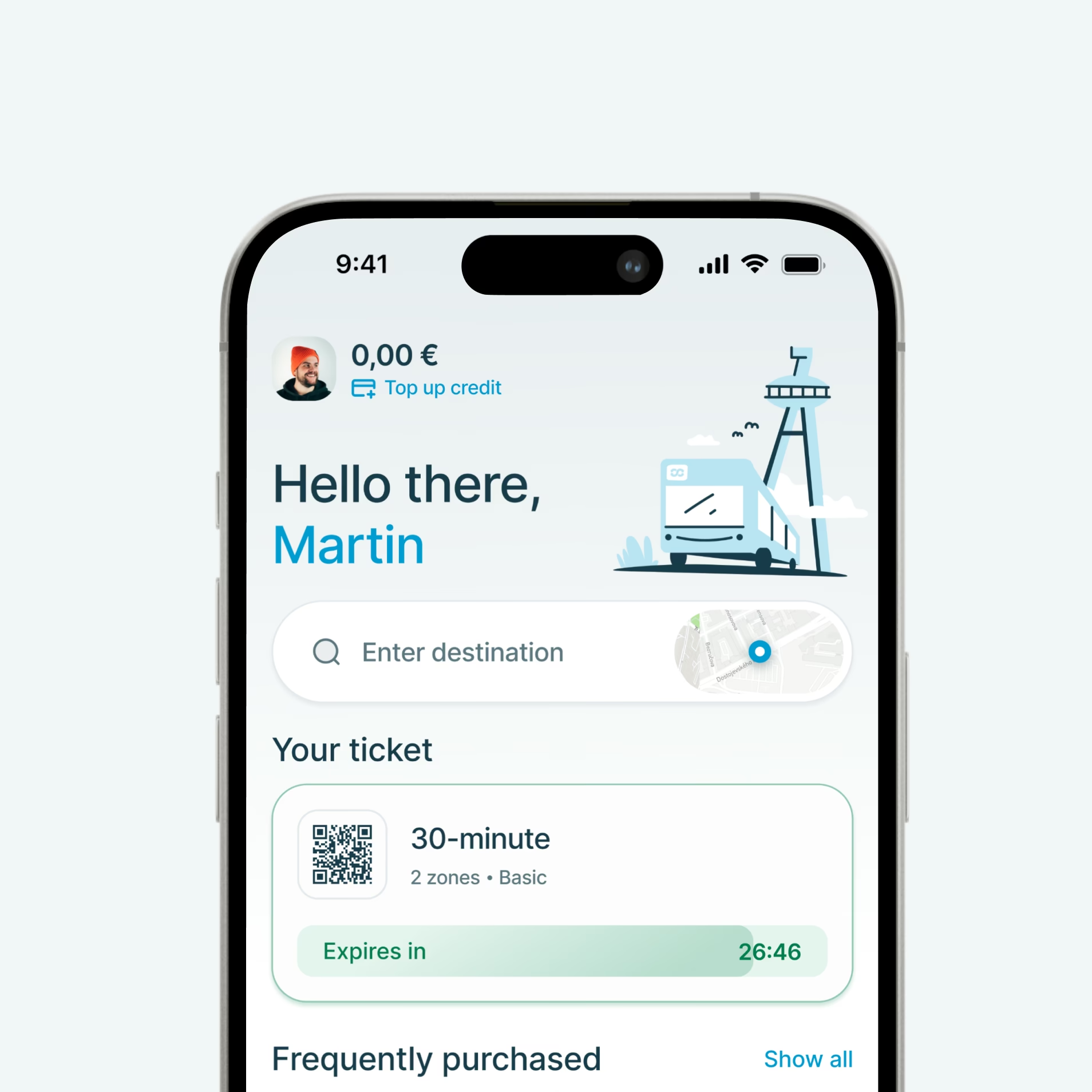
Made tickets, routes and departures easier to find.
- Quicker repeat purchases. A compact purchase flow brings the usual ticket and previous payment choice forward.
- Journey planning on the home screen. Route search sits alongside ticket purchasing instead of leaving passengers to assemble the journey across apps.
- Saved addresses and favourite routes. Familiar destinations become shortcuts, with relevant departures and disruption information.
- Less friction before trying the app. The design removes mandatory registration from the initial experience and supports simple sign-in when needed.
- Help choosing travel zones. Passengers can enter the start and end stops and use the zones along that route.
Kept repeat ticket purchases to the essential steps.
Research showed why speed mattered: passengers often bought their ticket when they could already see the bus approaching. We designed a compact purchase window where a returning user confirms the starting stop and uses their previous payment choice. Options for changing activation time or buying additional tickets remain available through an expanded view. The common purchase stays short, while less frequent needs still have a place.
This is the practical aim of improving a poor customer experience: remove the work people should not have to do just to complete an ordinary task.
Resolved confusing ticket choices before implementation.
We tested the important journeys in wireframes before completing the full design. One finding was especially useful: half the participants interpreted additional tickets for companions, luggage or pets as tickets they could save for later. In reality, those tickets applied to the same journey and time. We added a prominent explanation and checked the revised design again.
Another issue came from the QR code on an active ticket. Some visitors to Bratislava did not know whether to scan it, show it to the driver or do something else. A small label explaining that it was for inspection made the intended action clearer.
Testing also challenged our assumptions about familiar layouts. We had used patterns from Google Maps for route details because passengers already knew that product. Yet participants still confused stop names, route names and street names. We reorganised the information to make those distinctions clearer. Familiar styling was a useful starting point, but watching people interpret the screen showed where it fell short.
Access was another area where we wanted evidence. We tested passwordless email links with older passengers as well as other groups. Older participants understood the approach and welcomed not having another password to remember. That gave us a firmer basis for a simpler sign-in experience instead of designing around assumptions about age.
Zone selection needed a different response. An interactive map initially seemed promising, but it added cost and complexity without removing the passenger’s uncertainty. The simpler design asks for a start and destination, then shows the zones along the route. The lesson was to resolve the user’s decision, not introduce another interface to learn.
Made future design changes consistent across 500+ screens.
Once the core journeys were validated, we developed the visual direction and a reusable design system. Shared colours, typography, spacing and components supported both light and dark modes. They also gave the implementation team a consistent set of patterns to work from.
We defined those shared design values as tokens: reusable settings for details such as colour, spacing and type. A change could then carry across the design instead of being repeated screen by screen. Light and dark themes used the same underlying structure, giving IDS BK a more manageable foundation for future design changes.
The design covered more than ideal conditions: empty screens, errors, offline states, forms and maintenance messages were included. Custom illustrations and Lottie animations added character without replacing the information people needed.
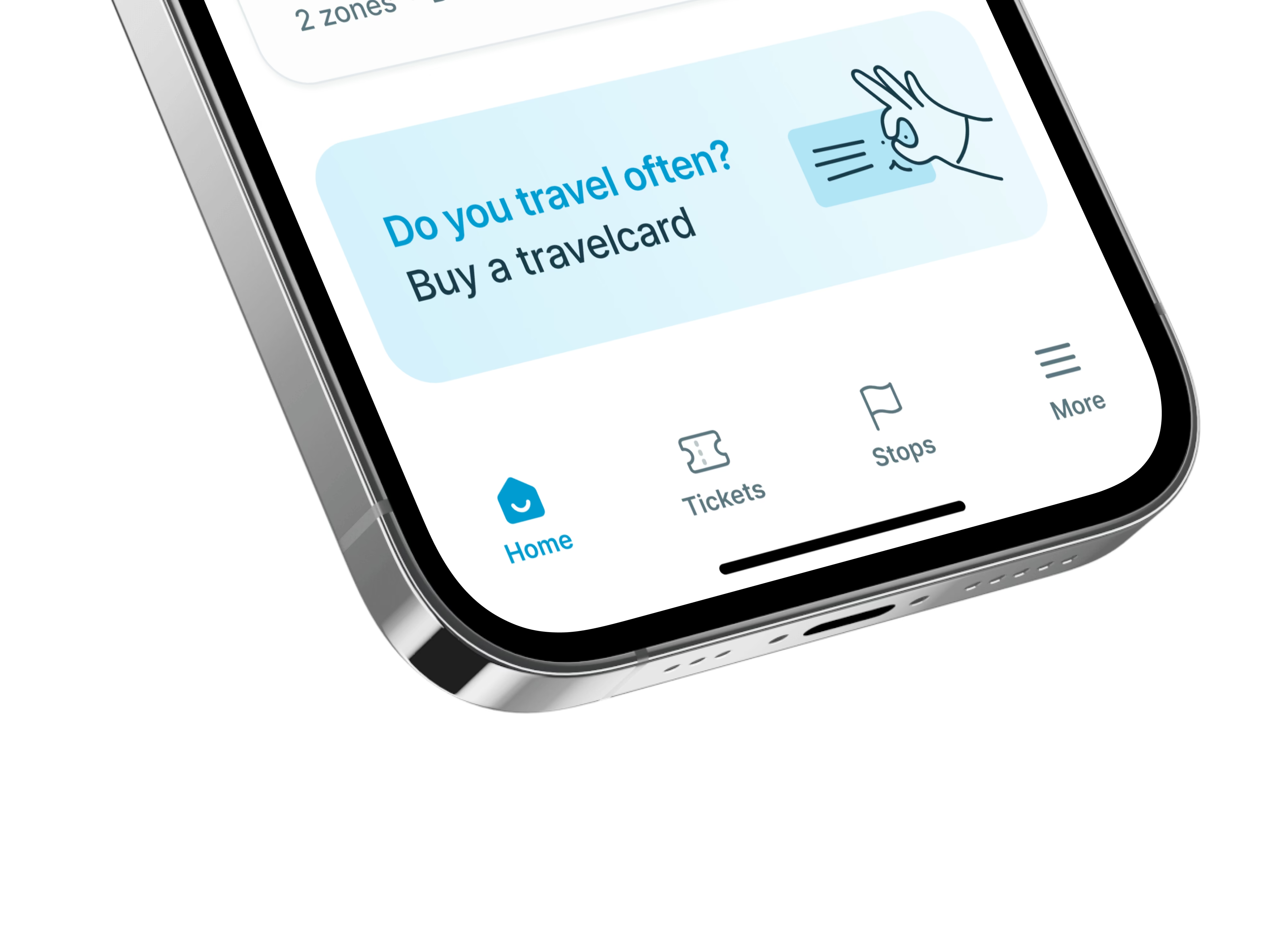
For IDS BK, the value was a clear, tested direction for its passenger app, with confusing steps addressed before implementation. It is also an example of tackling software adoption through practical usability, not simply adding more features.
Explore the visual case study, or read the original articles for a closer look at research, usability testing and design.