
Design Concept
After testing the wireframes, which helped us fine-tune key flows and functionalities, we moved into the design phase with a clear vision. We started with a moodboard, which laid the foundation for the lead design. This design went through several iterations, and we enriched it with custom illustrations. Subsequently, we created a design system using tokens and gradually designed more than 500 unique screens in both Light and Dark mode.
We Started with a Moodboard
We start each design phase with a moodboard, where we collect dozens of inspirations from various apps and websites, focusing exclusively on the visual aspects. It doesn't matter whether it's a banking app, a fitness platform, or an e-commerce site – what matters is the overall impression and aesthetics. Each moodboard represents a specific visual direction, such as "Clean and Modern," "Playful," or "Elegant and Minimal."For the design, we drew from the existing brand manual, which set the basic visual rules, but we had the flexibility to adapt it to a certain extent. This balance between brand consistency and creative freedom allowed us to find a visual style that is not only aesthetically appealing but also functional. After a series of discussions and feedback rounds, we agreed on a "Clean and Modern" direction, complemented by subtly playful illustrations.
Many Iterations of the Lead Design
After defining the moodboard, we moved on to creating the Lead design, which is a key part of every project. It helps us explore different visual possibilities and guide the product toward the ideal design solution, always considering not only aesthetics but also functionality and user experience. During this phase, we go through multiple iterations of the main screens – in this case, the home screen and later the route detail – to find a balance between the visual aspect and intuitive navigation. The Lead design defines the design direction and is the first step toward creating a cohesive design system that ensures consistency throughout the entire app.
Illustrations and Animations as Overdelivery
At Outloud, we don’t just do what’s in the scope – we do what’s right for the product and its users. If we see room for improvement, we’re not afraid to go beyond the brief, often at our own expense. In this project, there was no budget for illustrations or animations, but we believed that without them, the result wouldn't be complete, so we decided to create them ourselves.
We hand-drew the illustrations and animated them in Lottie, making it easy to implement in development while also brightening the day of those who have to get up at 5 a.m. for work – because even small visual details can make a big difference.We believe that these kinds of details can elevate the user experience and make the product not only functional but also visually appealing and intuitive.

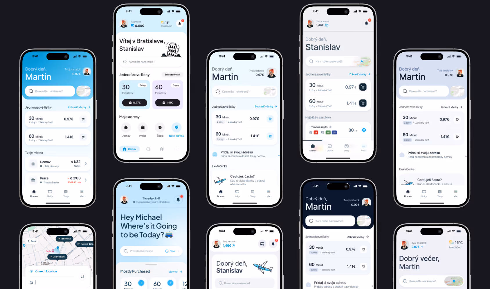
Tokens and Design System are the Foundation
The foundation of quality design is a well-established design system. It ensures consistency, speeds up the design and development process, and optimizes costs. Thanks to the continuous development of Figma, we can now define the design system using tokens, which brings numerous benefits for both designers and developers.
- Light & Dark mode with one click – thanks to tokens, we can define color variations for both light and dark modes at the system level. This means that instead of manually redrawing all screens, we only need to switch the token values, and the entire design will automatically adapt to the new mode
- Simple adjustments – instead of manually modifying all components, you only need to adjust one token, and the design will automatically update across the entire project
- Consistency across the entire design – colors, typography, paddings, and other elements are defined in one place, eliminating inconsistencies in the design
- Smoother collaboration between designers and developers – tokens are exportable directly into code, such as in the form of JSON, CSS, or Tailwind config
- Easier code maintenance – when changes are made, such as updating the primary color or text size, you only need to modify a single token instead of updating hundreds of lines of code
- Better optimization and performance of the app – defined tokens reduce unnecessary duplication of styles and streamline CSS or component libraries.

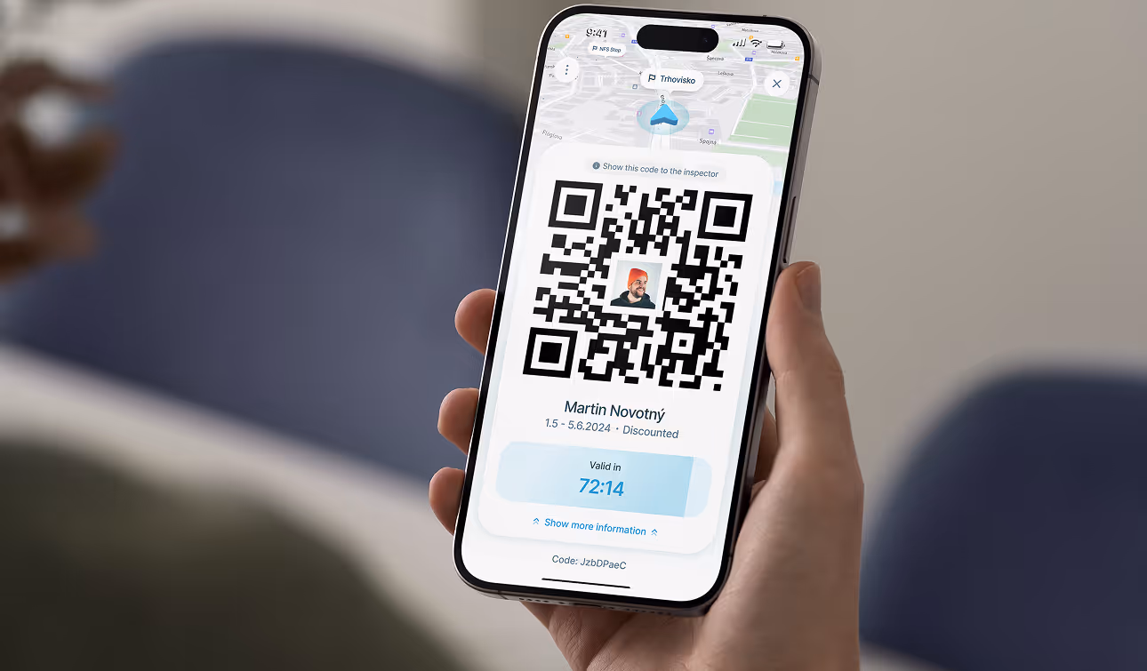
Final Design
The entire process of this project culminated in the design of all screens. We created over 500 screens in each mode and paid attention to every detail. We covered all possible states – from empty states and error states, offline mode, to interactions when filling out forms, as well as 404 pages and banners for app maintenance.