A clearer view of your customers.
Design system
Developer handoff
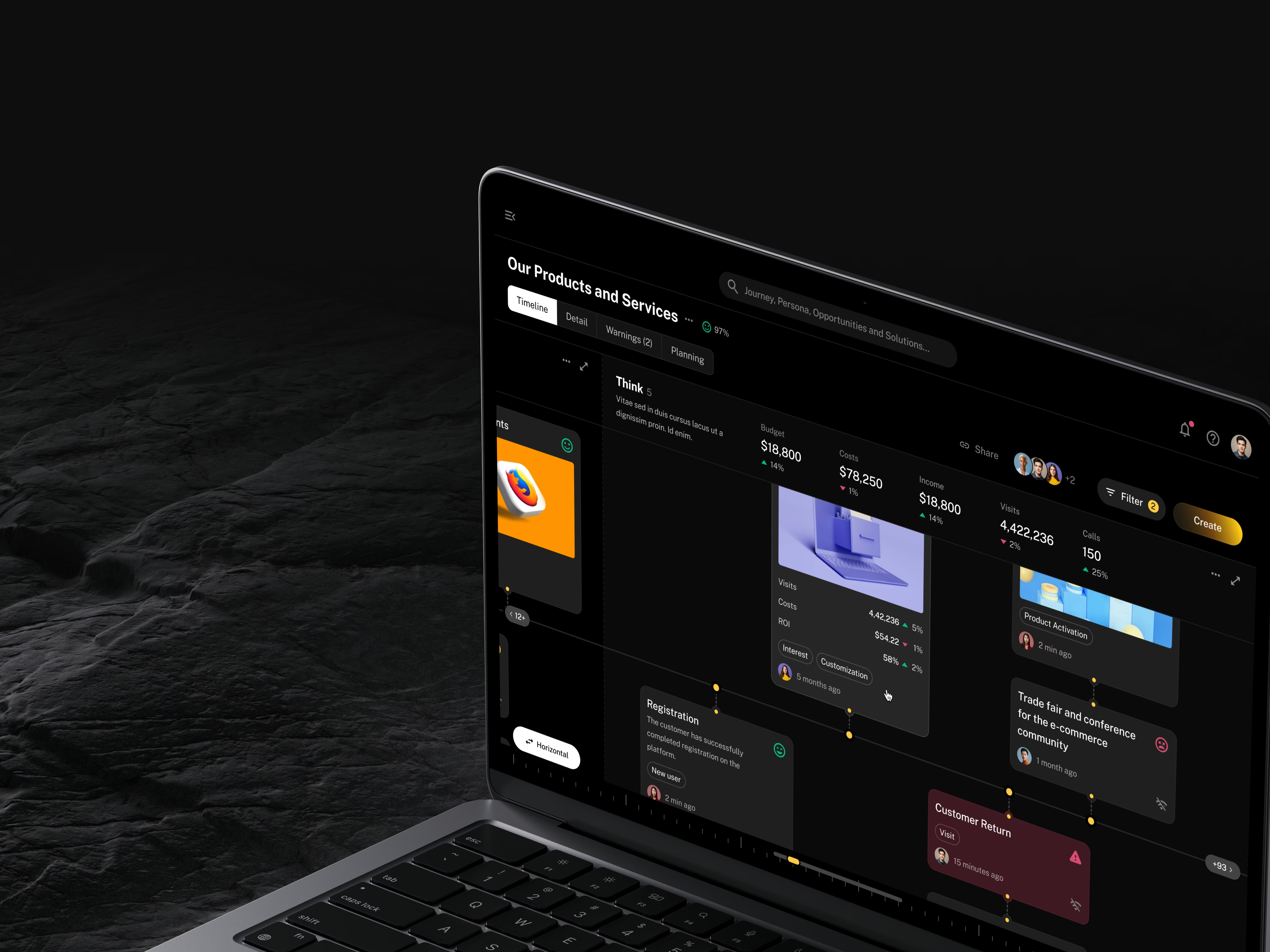
Teams can see where the experience needs attention and make better-informed decisions. A consistent design system also gives the client’s developers a clear foundation to build on.
- A shared view of the customer journey
- Clearer layouts for complex business data
- 100+ screens designed
- Reusable components for the client’s development team
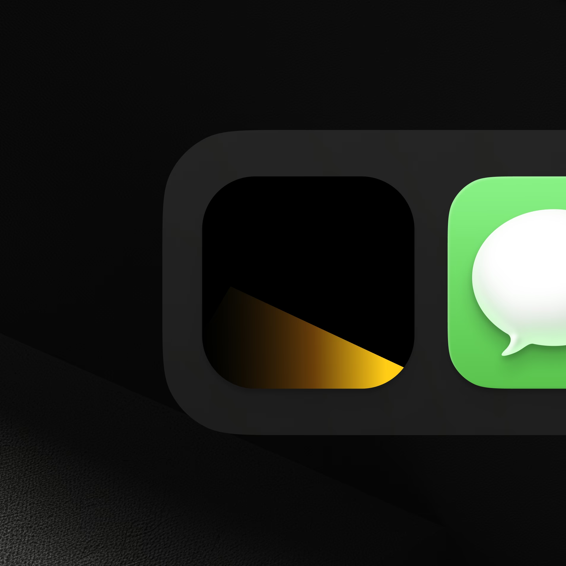
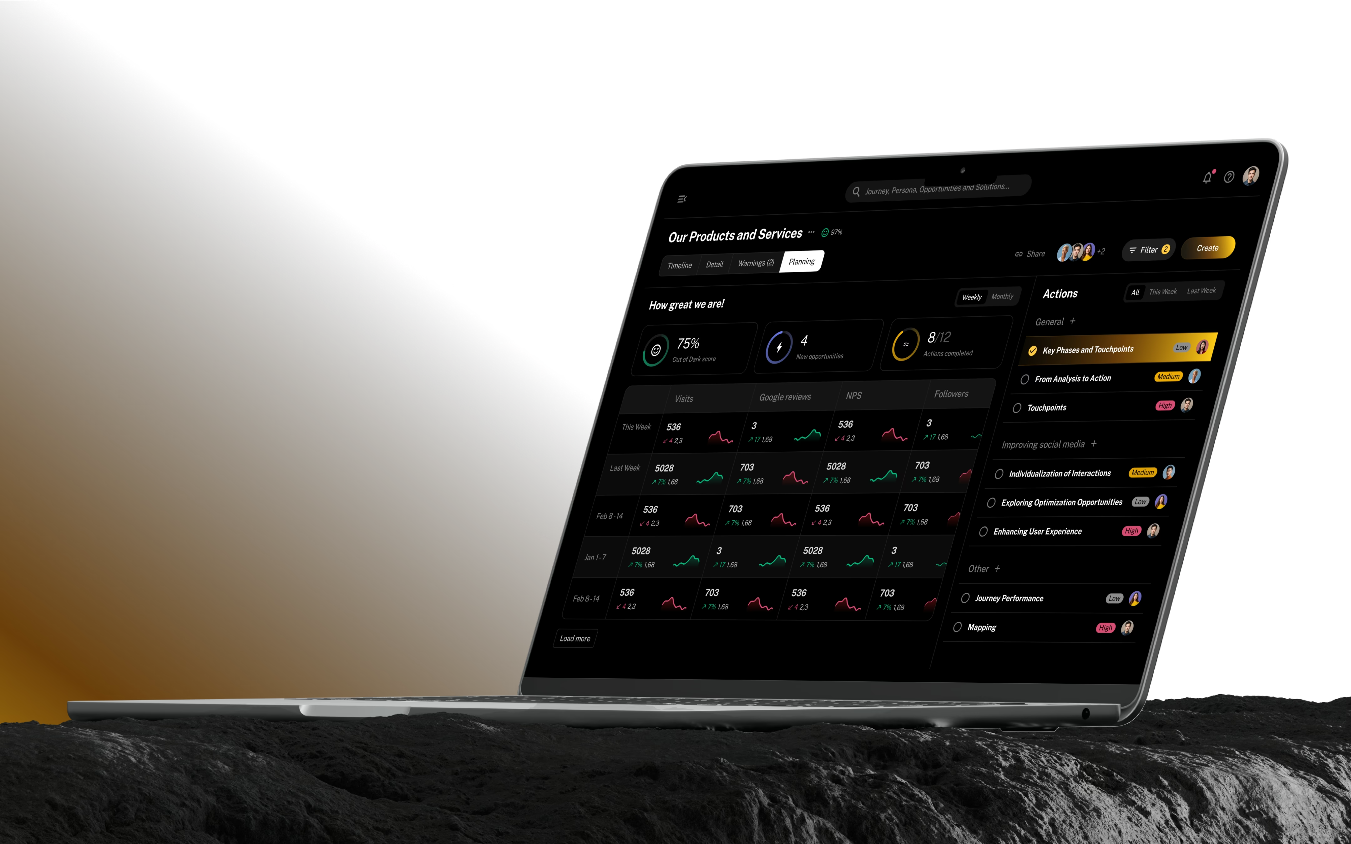
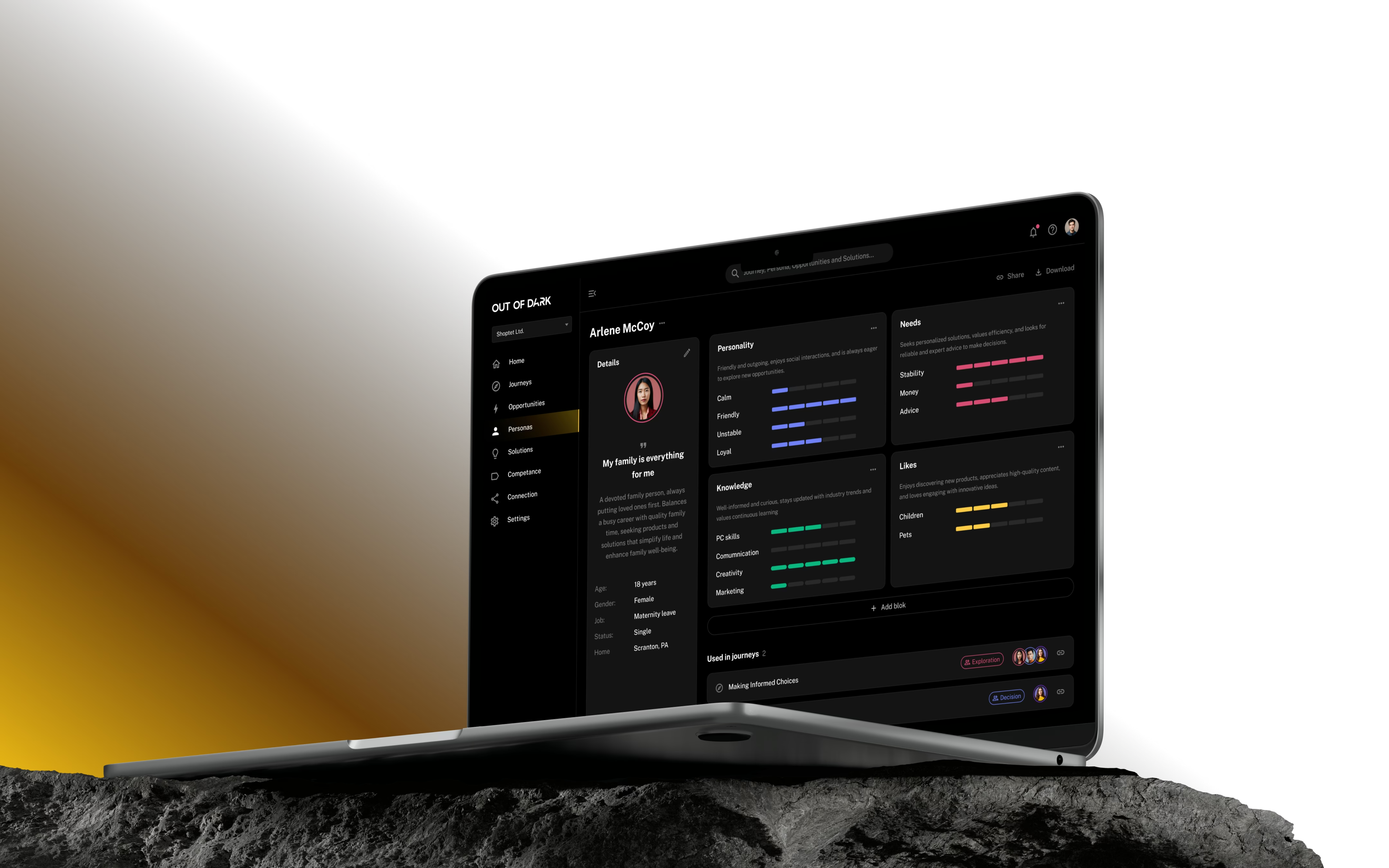
Made complex customer reports easier to scan with a clear visual structure.
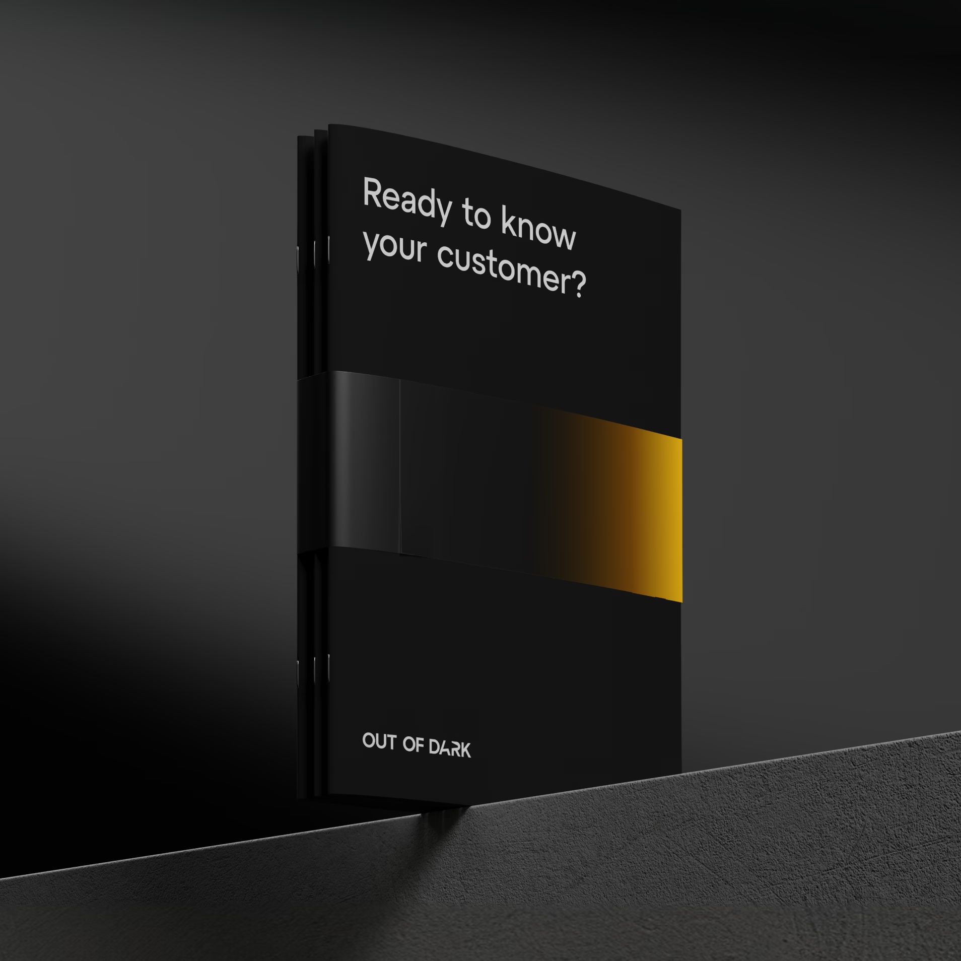
We developed the brand alongside the product, so the interface felt like one coherent experience as it took shape.
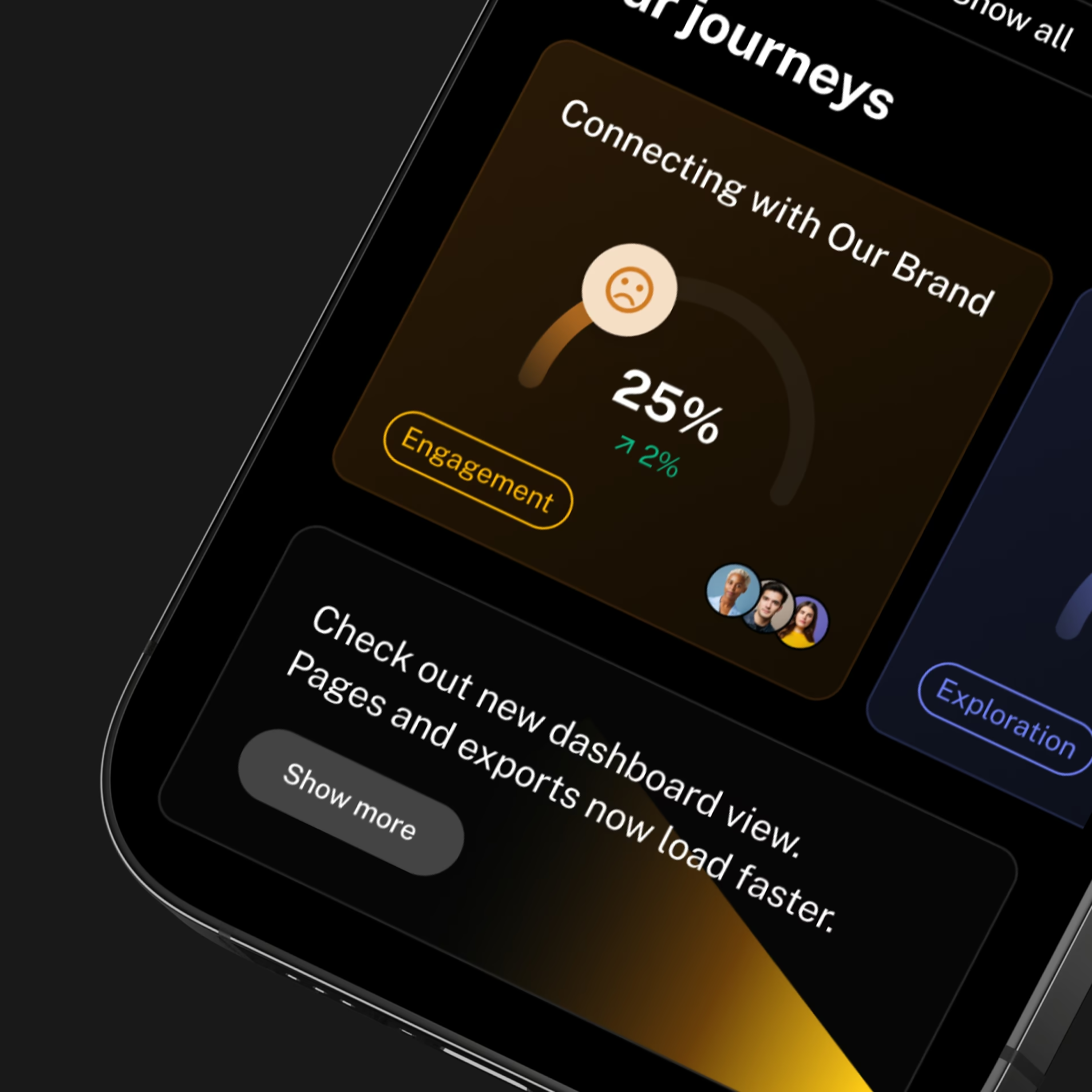
The identity uses light as a visual theme. We carried it into the interface while keeping reports and customer data easy to scan, balancing a distinctive look with the work users need to do.
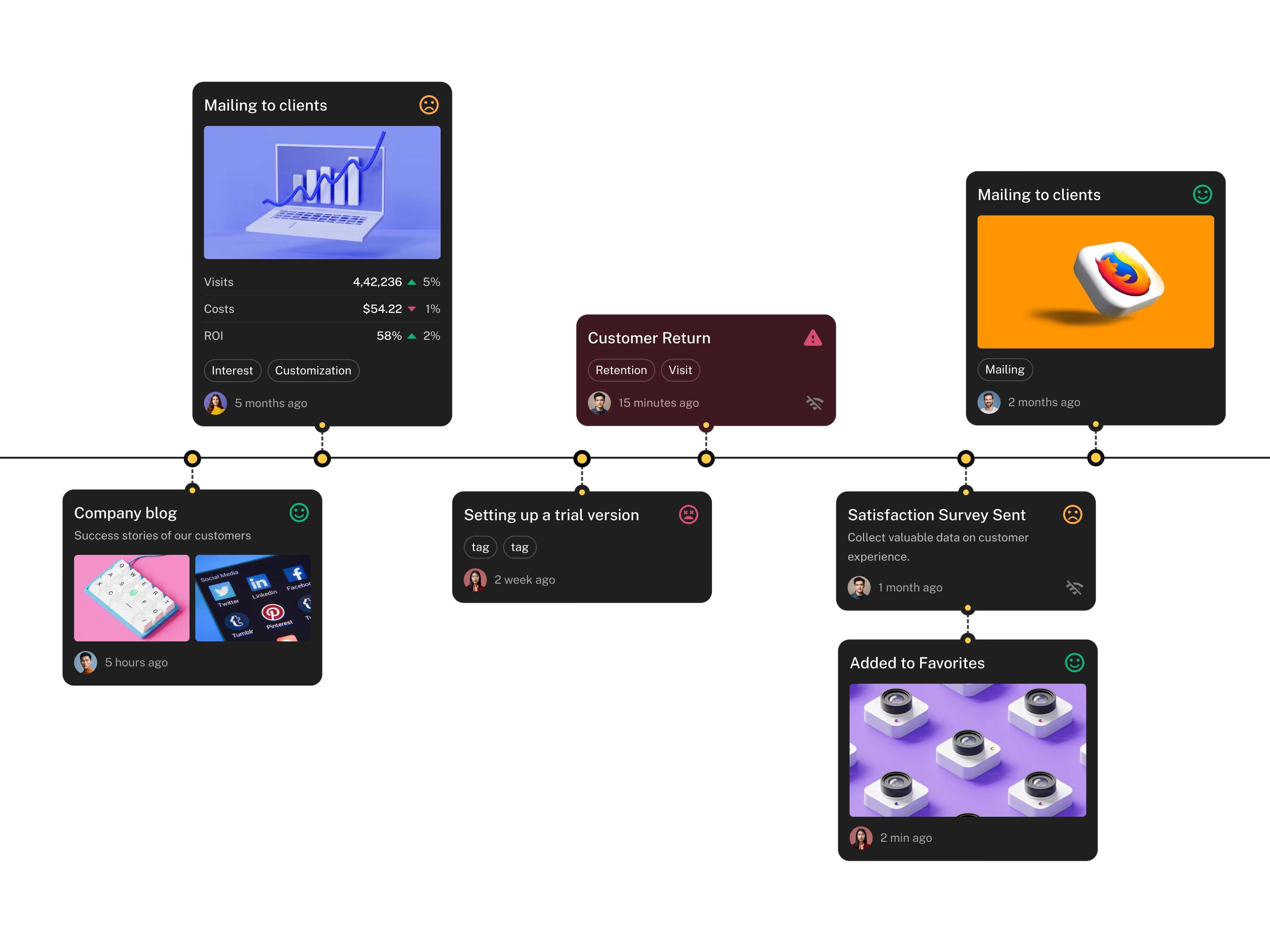
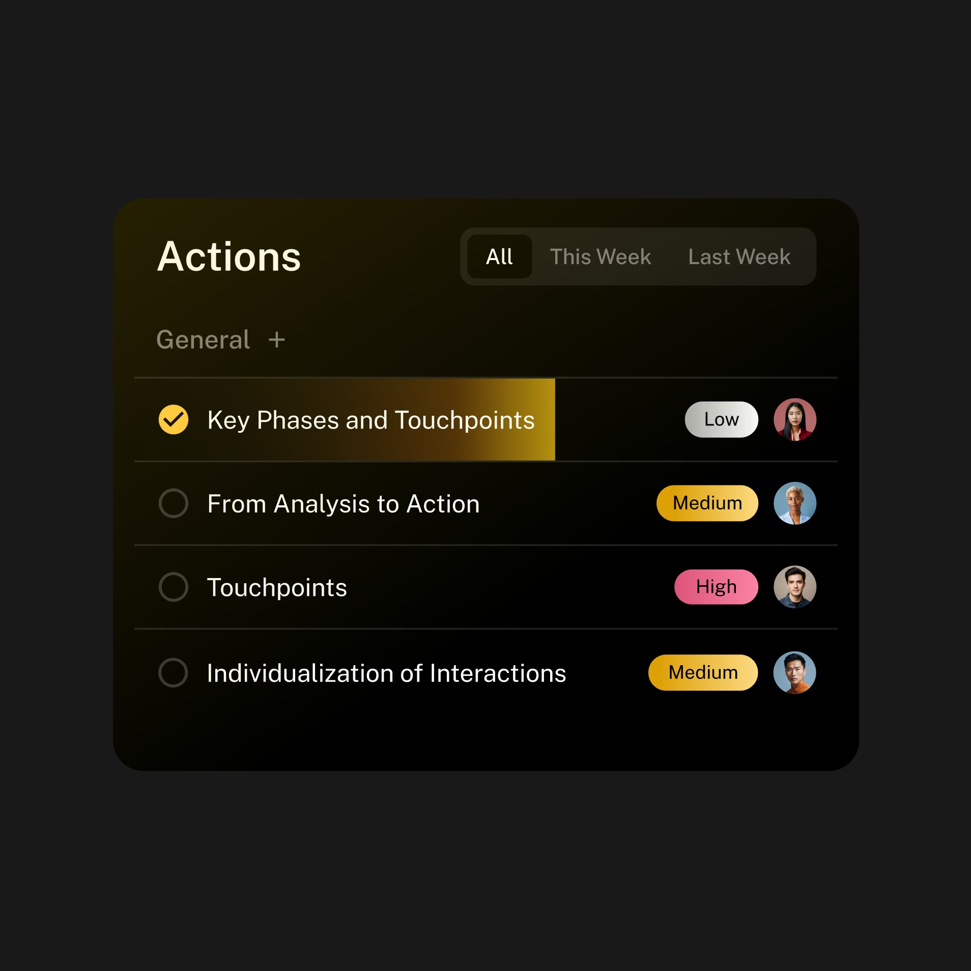
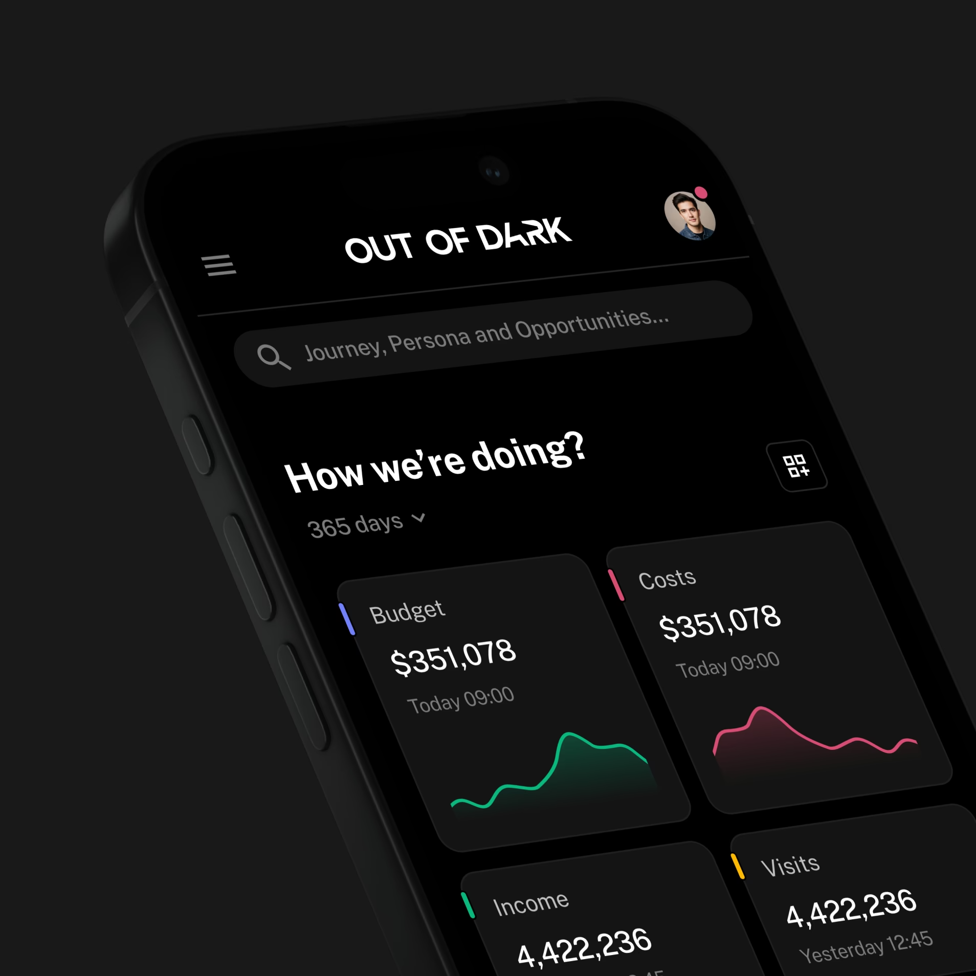
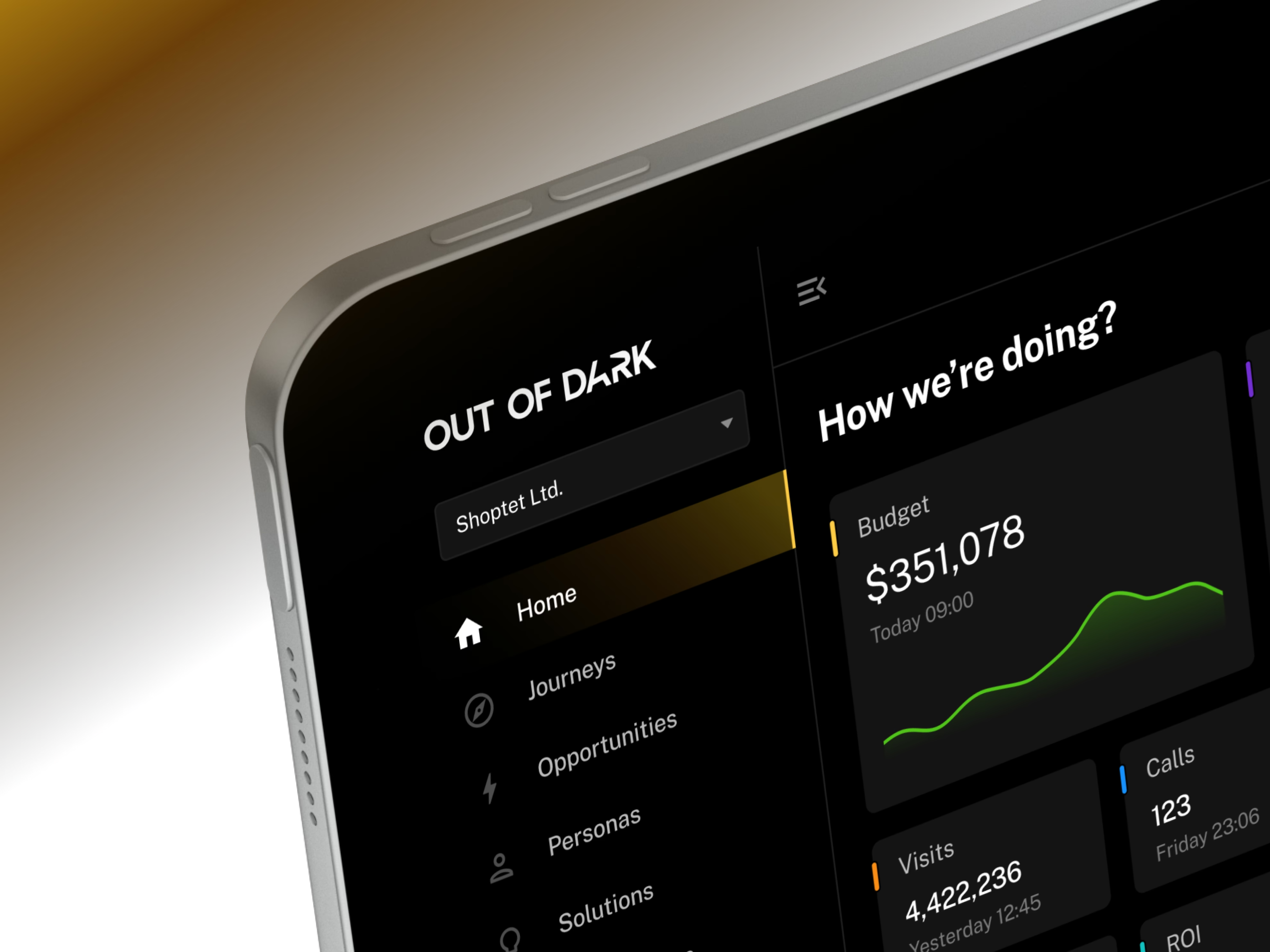
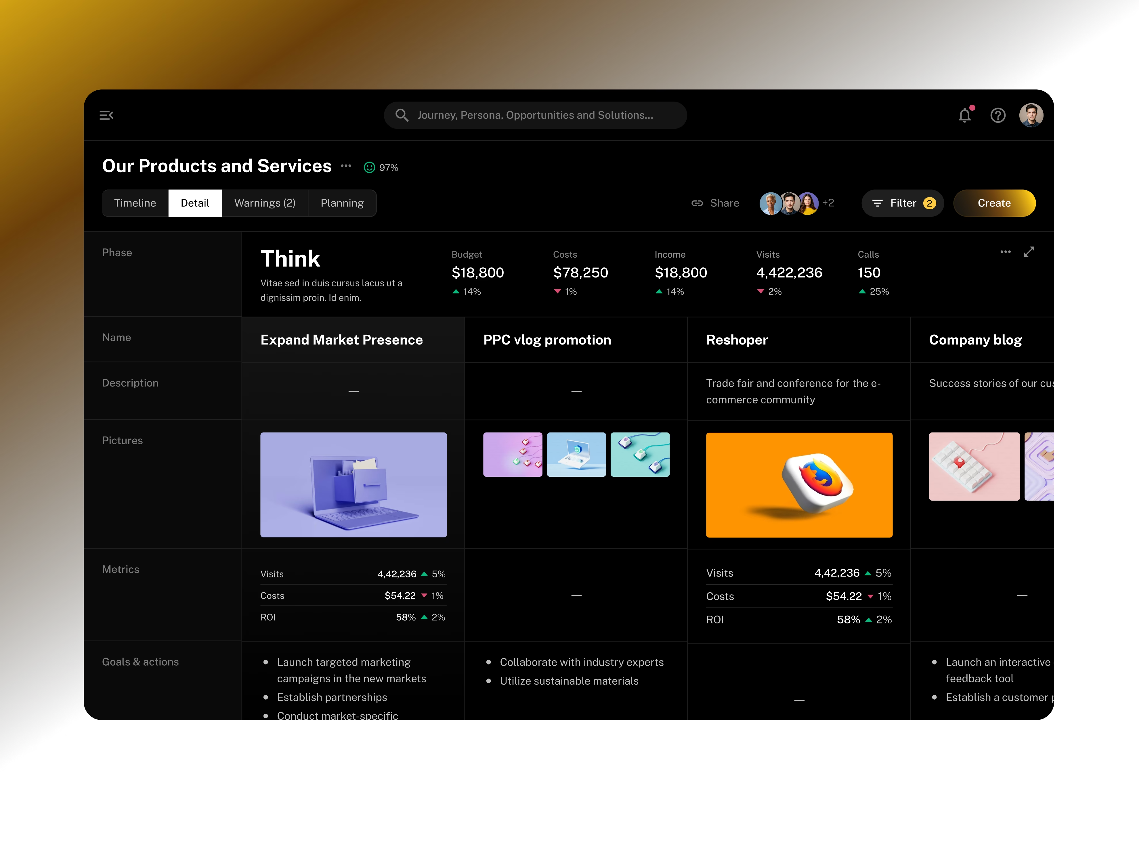
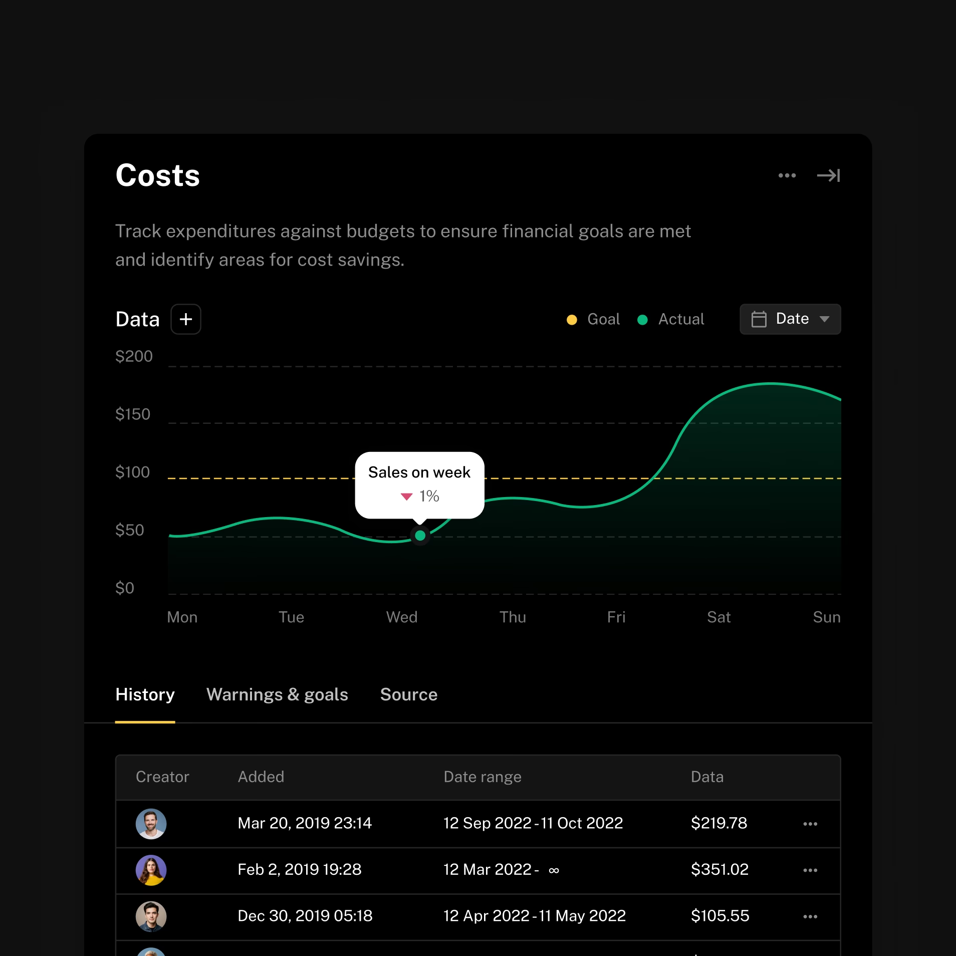
Made spending and customer satisfaction easier to compare in one view.
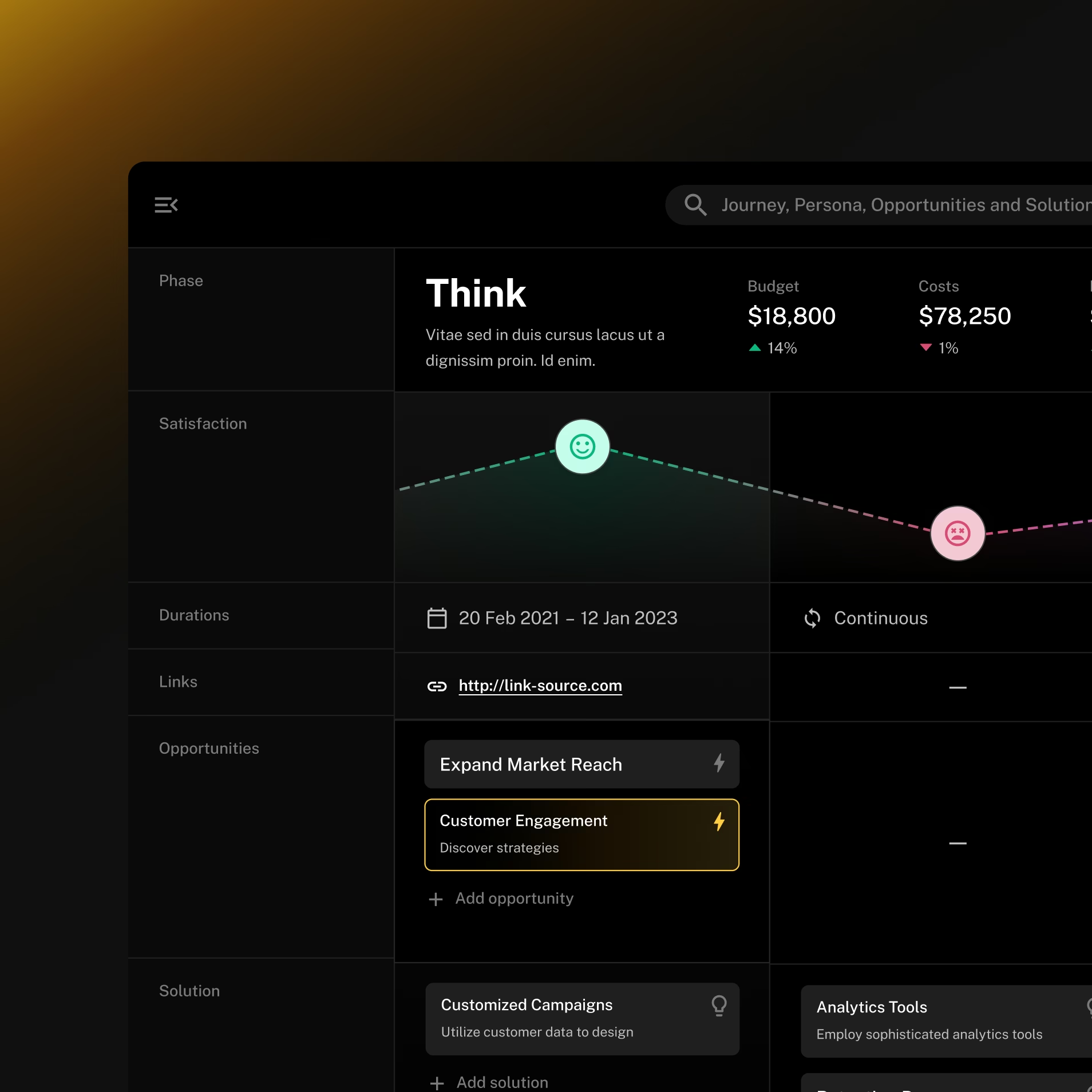
The platform brings budgets, visits, calls, and satisfaction into the same journey. We gave that information a clear structure so users could compare what matters.
Card layouts, visual hierarchy, and colour-coded indicators help separate signals in a dense interface. Users can move from the wider journey to the data behind a specific point in the experience.
Simplified the handoff to developers with reusable interface components.
Understand the journey
Design the views
Prepare for development

“The collaboration with Outloud was outstanding from start to finish.
They understood our vision and delivered beyond expectations. I recommend them without hesitation.”

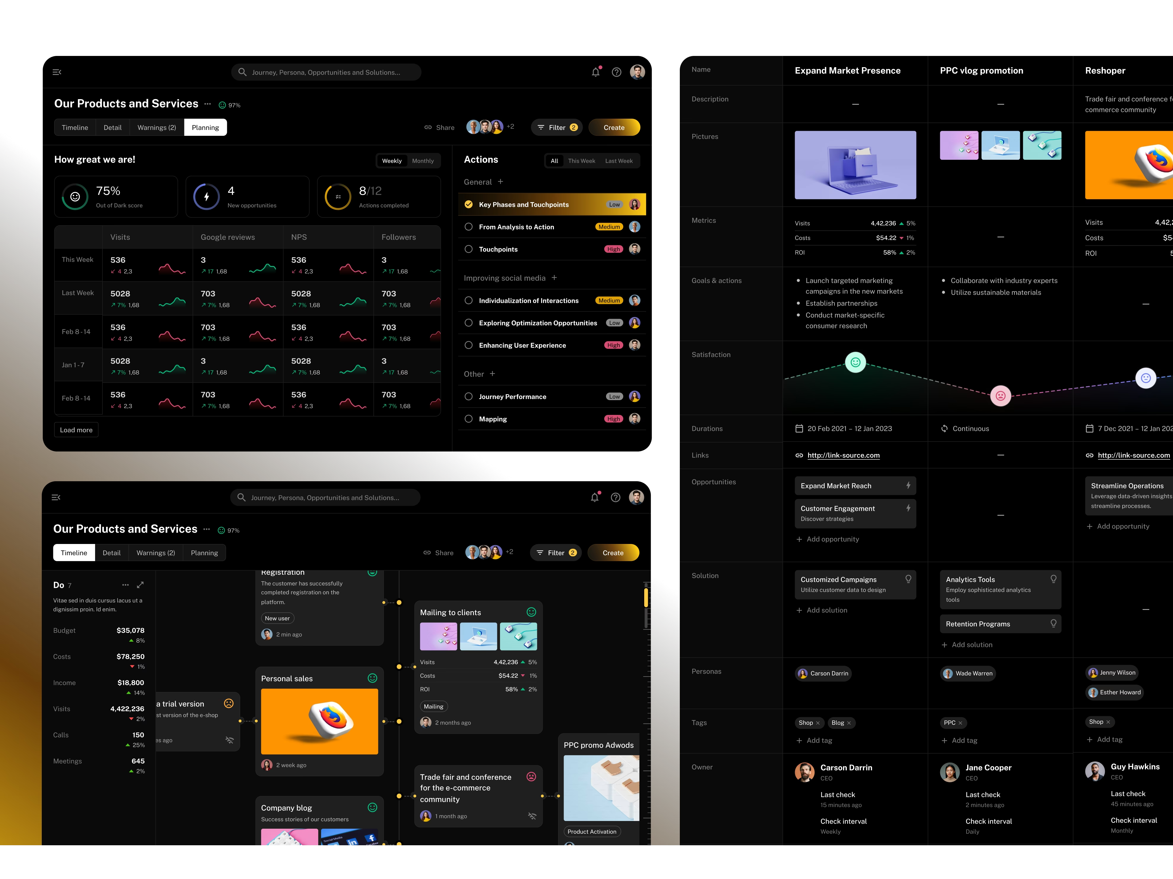
Made customer experience easier to assess alongside business results.
The adapted component library gives the client’s team a foundation for implementing and extending that design.